
As part of our efforts to continuously improve our oto.my car classifieds, we’ve revamped the design of our search result pages to make it easier for you to look for your next car.
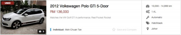
Above you will find the default view which is called the List view, which has had some changes to the way things are positioned to make it easier for you to scan through the search results. The image is now larger and the important details like the listed price is now closer to the photo so your eyes do not have to scan from left to right so often.
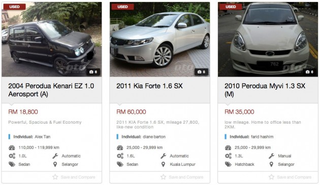
This is the Grid View, which is kinda like browsing print classifieds and probably popular with those browsing from a tablet.
The title field now has two lines to more accurately describe that ad being shown and there are now more details than before, all packed into the same area that the previous grid view took up.
We found that people weren’t really using the previous Table View that much, so we phased it out. The Table View actually had the smallest photos of all three views in order for people to scan most listings at one go. We also got feedback that some people actually prefer more photos, and larger ones at that.
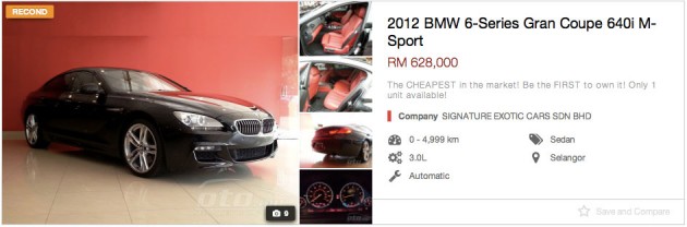
So we present to you the new Multi View, which shows huge photos along with a small collection of thumbnails so you can view more angles of the car in the search results itself before you click on a listing.
Let us know what you think, and if you would like to sell your car on oto.my, you can do so for free by clicking here. Cars for sale on oto.my are also featured in our paultan.org sidebar.


Please make option to search by fuel type too. I am a fan of diesel car and it is impossible to search using existing search fields.
Btw what does color have to do with search?
60k for 2years forte! wow! good value….pffftt