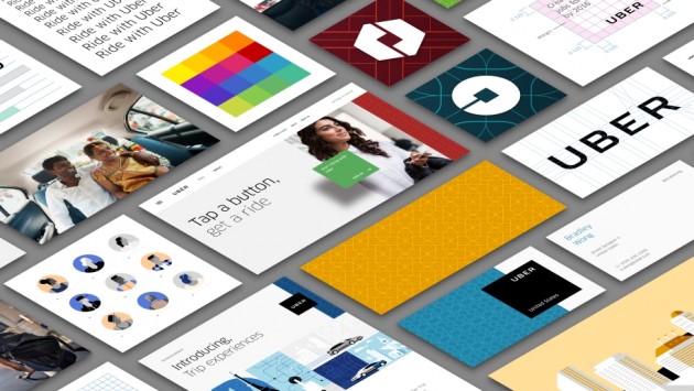
Uber has rolled out a new look and feel, one that celebrates its technology as well as the cities it serves. In announcing the rebranding, co-founder and CEO Travis Kalanick says that it’s taken two years for the refresh job to get to where it is now.
The changes are led by a new logotype, which Kalanick says is at once more grounded and elevated, and will help riders see Uber from afar and when it’s located in small places. The logo, he adds, also reflects a more substantial look, symbolic of how Uber has matured as a company.


The transportation network company – which currently offers its range of services in more than 400 cities in 68 countries – has also introduced the concept of the bit throughout its design framework. This, it says, puts its technology front and centre as well as provide consistency, highlight information and make the brand easy to recognise.
Another new design element is the addition of new colours and patterns to the overall presentation. The old Uber was black and white, somewhat distant and cold, which belied what Uber actually is — a transportation network, woven into the fabric of cities and how they move.
![]()
The design team spent months researching architecture, textiles, scenery, art, fashion, people and more to come up with authentic identities for the countries where Uber operates, and each market will – as it progresses – feature its own unique colour palette and, more importantly, character.
Lastly, there’s a new app icon, again working along the new premise of bits and wider colour range. Both new rider and driver icons have the bit at the centre, and then the local colours and patterns in the background. Kalanick says that this new framework will also make it easy to develop different icons for new products over time.
Locally, Uber’s expansion continued its run last week, when the company announced that it had begun operating in Ipoh, the fourth city in Malaysia that the app covers.
Looking to sell your car? Sell it with Carro.
