
Having revealed its new logo and tagline just this morning, Proton has also confirmed that the new emblem will be featured on all of its future models.
As expected, the new logo will be introduced on the new Perdana, which we know will be launched at the end of Q1 following this morning’s media preview of the car. Next to feature the new-look badge will be the coming next-gen Saga and Persona – both models we know to be just around the corner, having been spied on several occasions already.
After 30 years of experience, learning, improving, and investing, we've reached a new dawn. An era that will have you know and think about us… differently. A new chapter that will bring you quality cars that deliver attractive designs. great value, and utmost safety. We've put our minds and hearts, along with millions of man-hours of research and development, into ensuring we produce cars that we are proud of. And cars you'll be proud to own. The proof will be in the driving. And there's no better way to convince you but for you to test drive our cars yourself. Therefore, along with our new PROTON logo, we now introduce as our new signature message: "It’s in the Drive!" Consider it our invitation to discover a new era of purpose, energy, innovation and focus. Welcome to the new PROTON.
Posted by Proton Cars on Tuesday, 16 February 2016
Beyond this, Proton says that its new logo will eventually feature on all of its future models, either as part of facelifts, or on all-new models altogether. Also, if we’re lucky enough to see the rebadged Suzuki Ertiga in Malaysia soon enough, you can count on that model to also get the latest Proton insignia.
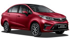
Having seen the logo ourselves, we can confirm that it is in fact a three-dimensional one that ditches the previous flat surface design. We can’t quite show you the new logo in action on the new Perdana just yet (our cameras were taken from us at this morning’s preview), but based on the images here, what do you think of it so far? Tell us what you think in the comments below.
Looking to sell your car? Sell it with Carro.


proton sucks..toyota all new hilux better
Who cares about the emblem, QUALITY is the main issue!
same loor,the TIGER logo is damn annoying.It looks angry and hungry…perhaps due to its falling sales.
Those damn fools think by changing the logo,sales will rise.By giving 24 hour service for breakdowns,sales will rise.
But the reality is,like Tun said “Buyers still perceive protong to be of inferior quality”.
For the next 100 years,once bitten twice shy….this will be the perception of Protong unless bradder Honda overtake /overhaul the bladdy organisation to make it more attractive to buyers.
Like what the new MAS kwai loh MD has done,Protong need to f…off the dead wood and crony suppliers…..then buyers will change their perception on Protong’s QC.
Protong just took over Suzuki’s service centres.Thats why they have to come out with programmes to keep the service centres busy.They have too many.
3D? Zahid DPM says Malaysian youths don’t like 3D – dirty, dangerous, difficult things. Proton has failed our youths.
New logo 3D doesnt make Proton have good RV! Enough said!
Nonsense.
Sales and market share dropping like mad and they choose to focus on a new logo?? Like a new logo will actually boost sales??
Tiru thunder cats logo laa. Logo sendiri pun tableh buat, mana nak buat enjin atau kereta sendiri
Rajin songlap boleh lah. Proton boleh! Malaysia boleh!
Apple, Microsoft, Android all go for flat, simpler design. Volvo’s new logo also look flat and simple.
Proton go backwards. 3D is so last decade. All in the name for some crony graphic designer to songlap. Poi.
This is designed for Bangla, as DPM said, they like 3D more than Malaysian youth.
The tiger in the logo looks so lame and lacks energy to compete; exactly like the carmaker.
Ape bende comment entah apa2, post ni memang untuk logo la, sebab pagi tadi ade conference, banyak je post lain, isu warranty, isu service x bagus, isu quality (diorang dah hire ketua QC dari Nissan lagi). Cubalah comment macam berilmu sikit. Mentaliti x berubah2. Sigh…
Meanwhile every other company is ditching 3D skeumorphic logos and going with flat logo design.
Tagline font is just too microsoft word, exclamation point is redundant.
Shows how backwards their mindsets are.
The new trend now in logo is to make it simple, and flatter (no shadows/embossed/shading etc)
Proton on the other hand is going backwards, making things more complicated in their logo and adding all the 3d effects etc.. That is so 2000.. get with the time!
sometimes too much hate these fellas forget they are pointing at themselves..
Oh dear, why is Proton’s Tiger being caged in a thicker & stronger bond? How is the Tiger going to break free & roam the world?
In real world analogy, how is Proton going to break free from all the negative vibes or perceptions & venture into the other parts of the world?
korg yg komen tu ..korg bodoh…then korg buat la design sendiri sial .. anjing !