What do you think of the new layout?

We’re trying out a new look over here and since this site would be nothing without you readers, we’d like to ask for some feedback. What do you think of the new design? We went for a 3 column layout to allow us to highlight certain content like the test drive reviews better while minimize scrolling.

There’s also a new comment feature where you can reply to a particular comment. No more copying and pasting the comment that you want to reply to. Hopefully this will result in cleaner and more meaningful conversations.

Most importantly, the new theme structure fixes a problem that the old theme had with WebKit browsers like Safari and Chrome. Please share what you think of the new layout – your feedback is very important to us!

UPDATE: OK, I’ve switched to a 2 column layout and tried my best to make it look like the old layout. Any feedback on this? I feel like a certain government, flip flop here and there!

I personally prefer 3 column but it seems I have overestimated the average monitor resolution of some readers, 3 column made the site too wide and caused left and right scrolling. How about this, is it better? Exactly the same 900 pixel width as the old layout, but with the Chrome and Safari fixes.
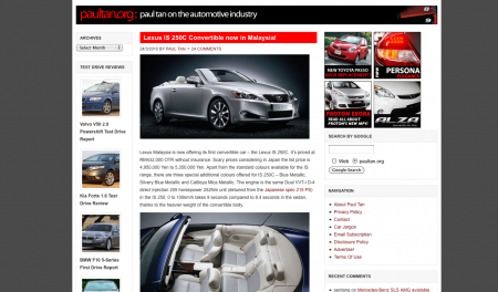
What do you think of the new layout?

[polldaddy poll=2946506]

Looking to sell your car? Sell it with Carro.

10% discount when you renew your car insurance

Compare prices between different insurer providers and use the promo code 'PAULTAN10' when you make your payment to save the most on your car insurance renewal compared to other competing services.

Car Insurance

Paul Tan

After dabbling for years in the IT industry, Paul Tan initially began this site as a general blog covering various topics of personal interest. With an increasing number of readers paying rapt attention to the motoring stories, one thing led to another and the rest, as they say, is history.


Comments

  • the previous 1 is much better !

    Like or Dislike: Thumb up 0 Thumb down 0
    • Paul Tan on Mar 24, 2010 at 9:01 pm

      Much better in which way? If you can point it out, we can merge the best points of the old layout into the new layout.

      Like or Dislike: Thumb up 0 Thumb down 0
      • Tiadaid on Mar 24, 2010 at 9:59 pm

        The white background is a bit of an eyeful, especially with all the wordings all around the page. The previous page's background is more soothing to the eye for me.

        The layout looks kind of cluttered. Maybe you can place the 2nd column (the Recent Post, Stories By Make etc) at the end of the page? Or make do without them? Anyway, I kinda like the reply feature. A much needed feature if you ask me.

        Like or Dislike: Thumb up 0 Thumb down 0
        • Paul Tan on Mar 25, 2010 at 12:02 am

          I have to clarify something – white background? The overall layout and colours of the site is exactly the same as the old one – white, grey, black and red. Right now, we have a white background for the blog area that sits on a grey background. Is what you see on your screen different?

          Like or Dislike: Thumb up 0 Thumb down 0
        • Tiadaid on Mar 25, 2010 at 1:24 am

          I don't see grey…only white

          Like or Dislike: Thumb up 0 Thumb down 0
        • Paul Tan on Mar 25, 2010 at 7:22 am

          You don't see this?

          http://img63.imageshack.us/img63/9401/newblogscre…

          Like or Dislike: Thumb up 0 Thumb down 0
        • Artz3 on Mar 25, 2010 at 4:06 pm

          well, yeah I see that, only when I'm using my wide screen Lcd. When a screen with a much smaller real estate, such as a netbook, the grey area wasn't even noticeable(which wasn't the case with old layout). But still overall, I like what I'm seeing.

          Like or Dislike: Thumb up 0 Thumb down 0
      • mystvearn (Member) on Mar 24, 2010 at 10:37 pm

        This is better I think.

        "Testing quote function and grouping points"

        Like or Dislike: Thumb up 0 Thumb down 0
      • rexis on Mar 25, 2010 at 7:51 pm

        +10 to the reply to quote function!

        Suggest to play around with collapse and hide function (+ / -)

        Like or Dislike: Thumb up 0 Thumb down 0
        • rexis on Mar 25, 2010 at 7:55 pm

          Yes, strongly recommend to add function to hide replied comments, or even add page. It will be messy if users can reply here and there and sort of like jump queue their comments when we used to have a linear comments structure last time.

          See, I used to look for last box to look for my newly added comment, now suddenly I am lost.

          But mayb this is just me.

          Like or Dislike: Thumb up 0 Thumb down 0
    • Anti Moron on Mar 24, 2010 at 10:11 pm

      the previous layout look alike "Paultan's trademark".. the new one look familiar with some foreign automotive website…

      Like or Dislike: Thumb up 0 Thumb down 0
  • mymofaz on Mar 24, 2010 at 9:06 pm

    now it's rendered properly in google chrome!

    Like or Dislike: Thumb up 0 Thumb down 0
  • Artz3 on Mar 24, 2010 at 9:09 pm

    The three column structure seem a little to crowded with the white background.

    Like or Dislike: Thumb up 0 Thumb down 0
    • Paul Tan on Mar 25, 2010 at 12:03 am

      The previous blog also had a white on grey background. Does it look different to you now?

      Like or Dislike: Thumb up 0 Thumb down 0
  • I also prefer the previous design, it's easier to read :)

    Like or Dislike: Thumb up 0 Thumb down 0
  • i like the previous one better… i think 2 column is better than 3 colums….3 column is too cluttered.

    that's just my opinion :)

    Like or Dislike: Thumb up 0 Thumb down 0
  • KitKat on Mar 24, 2010 at 9:11 pm

    The previous layout is much better than this cluttered one, but the comment section kick ass though!

    Like or Dislike: Thumb up 0 Thumb down 0
  • Bruce Ban on Mar 24, 2010 at 9:13 pm

    Hey Paul, I think the previous red highlighted title looks much better… and i don't know is it my eyes problem but the words looks kinda thin compare with the previous ones…

    Like or Dislike: Thumb up 0 Thumb down 0
    • Paul Tan on Mar 25, 2010 at 12:13 am

      I am now working on trying to replicate the old design for the titles. A challenge for me as HTML+CSS is not my forte.

      Like or Dislike: Thumb up 0 Thumb down 0
  • Abraham Tawi on Mar 24, 2010 at 9:13 pm

    Personally I prefer this layout, more user friendly and "usable" (especially with the addition of the archives scroll).

    However, it looks a bit messy due to too many words scattered all over the page but I'm fine with it

    Like or Dislike: Thumb up 0 Thumb down 0
    • middels8088 on Mar 25, 2010 at 2:28 am

      agreed.. but can you put a box on the post like the comments? its hard to read for me…

      Like or Dislike: Thumb up 0 Thumb down 0
  • p4k4abu on Mar 24, 2010 at 9:13 pm

    Paul,

    Looks nice to me.

    However, how about moving the small archive + test drive column to the left. I like things to look "balanced" ;)

    But that's just me … :D

    Like or Dislike: Thumb up 0 Thumb down 0
  • yientau on Mar 24, 2010 at 9:16 pm

    Nice! and yes, as mymofaz said…it's now rendered properly in Chrome. I like the "Test Drive Reviews" column. Two thumbs up. But a bit too crowded with the "navigation", "recent comments", "recent posts", and "stories by make". Can it be the left side column(1st column)? to make it a three column's blog.

    +——————————————————————+

    |_PaulTan.org____________________________|

    | | | |

    | 1st column | 2nd column | 3rd column |

    | | | |

    +——————————————————————+

    Just my 2 cents.

    Like or Dislike: Thumb up 0 Thumb down 0
    • Paul Tan on Mar 25, 2010 at 12:14 am

      I've tried your suggestion. It does look a bit more balance now. What do you guys think?

      Like or Dislike: Thumb up 0 Thumb down 0
      • Bruce Ban on Mar 25, 2010 at 1:26 am

        yeap it does… great job…

        Like or Dislike: Thumb up 0 Thumb down 0
      • Aaron Ch'ng You (Member) on Mar 25, 2010 at 6:57 am

        yes, It better now and u have done a great job……:)

        Like or Dislike: Thumb up 0 Thumb down 0
      • yientau on Mar 25, 2010 at 7:30 am

        yes, it's so much better now. I am a web designer, so I know how the arrangement "should" looks like. Love reading your blog, good job!

        Like or Dislike: Thumb up 0 Thumb down 0
  • cwchia on Mar 24, 2010 at 9:20 pm

    Hi paul,

    I have been reading yr car review article since 2006 and I never miss any of yr news b4,really love to read yr reviews on cars "clap".

    This is my first comment though after 4 years of reading ><

    I have notice some changes u make but i still prefer the old look, partly bcz of the colour contrast which i feel quite bright in this new outlook compare to the old one and the font also abit small, it will be tiring to read long reviews with such a small font.

    Just my opinion =)

    Cheers

    Like or Dislike: Thumb up 0 Thumb down 0
  • StarGhazzer on Mar 24, 2010 at 9:25 pm

    A more prominent banner would be better. This current one has a font size that is similar to the title of each post which in turn fails to stand out. The grey side bars has too much resemblence to carscoop.blogspot.com; although it's neat and tidy, I think it would be better to establish a colour theme/blog design that is uniquely "paultan".

    Like or Dislike: Thumb up 0 Thumb down 0
    • Paul Tan on Mar 25, 2010 at 12:15 am

      I've been using these colours way earlier than Carscoop ;)

      Like or Dislike: Thumb up 0 Thumb down 0
      • StarGhazzer on Mar 25, 2010 at 12:44 am

        lol… oops my bad…

        Then maybe a more larger banner to stand out more? :D

        Like or Dislike: Thumb up 0 Thumb down 0
  • Lancastrian on Mar 24, 2010 at 9:29 pm

    Can you add a link for us to see the comments from the readers? Such as "See Comments"

    For now, I clicked " Add a comment" to see readers' comment even though I might not want to leave any comment….

    Like or Dislike: Thumb up 0 Thumb down 0
  • Zack hakimi on Mar 24, 2010 at 9:30 pm

    ez 2 read…more informative….user friendly….congr8 paul….im ur fan since 2005….

    Like or Dislike: Thumb up 0 Thumb down 0
  • The new layout has addressed various padding, text size and script issues, and the new 3-column layout is functional and useful for us readers. However, the aesthetics side will need more work, i.e. Graphics for entries and stuff. Good job, nonetheless.

    Like or Dislike: Thumb up 0 Thumb down 0
  • exlive3 on Mar 24, 2010 at 9:31 pm

    i thought so there sumtin diff with paultan.org…i think this way is better….but then the main coloum is a bit small…

    Like or Dislike: Thumb up 0 Thumb down 0
    • Paul Tan on Mar 25, 2010 at 4:16 am

      The main column is actually exactly the same size as the old one – wide enough for images that are 450px wide. I had to keep the same size so that all the old images that's been posted over the years won't have to be redone.

      Like or Dislike: Thumb up 0 Thumb down 0
  • The new layout looks crowded, especially the 3rd column, feels like some sponsored ads. Prefer the old layout which is simpler and neat.

    Like or Dislike: Thumb up 0 Thumb down 0
  • msafwan on Mar 24, 2010 at 9:35 pm

    well, since most of us here are a long time visitors,we tend to prefer the old layout better.But no worries, it will take some time for the fans to adjust.

    Cheers!

    Like or Dislike: Thumb up 0 Thumb down 0
  • delio on Mar 24, 2010 at 9:35 pm

    i prefer the old one. simple to me. not too complicated like new one.

    Like or Dislike: Thumb up 0 Thumb down 0
  • The layout looks a little cramped… maybe because i am still using a non-WS monitor.

    The number of comments is no longer visible at the main page thus we wont be able to know at a glance which are the hot topics.

    Like or Dislike: Thumb up 0 Thumb down 0
  • kiat hoong on Mar 24, 2010 at 9:36 pm

    Looks like Malaysia Today

    Like or Dislike: Thumb up 0 Thumb down 0
  • Gajen on Mar 24, 2010 at 9:38 pm

    this new one looks neat but not attractive enough…maybe there should be more design,like the header or background…this new layout is plainly white,doesnt really tell if this is a car website…

    i like the comments,very decent and easy…=)

    Like or Dislike: Thumb up 0 Thumb down 0
  • Rammel on Mar 24, 2010 at 9:41 pm

    This is more like it.

    Just a suggestion, why don't you get those magazine theme wordpress.

    So it looks more interesting.

    And you can easily categorize each article into the right category.

    Example category,

    Manufacture, Geneva Showcase, Concept cars.. etc…

    Like or Dislike: Thumb up 0 Thumb down 0
  • Tan Ling Ling on Mar 24, 2010 at 9:41 pm

    I would prefer the main article set on middle column, and Navigation column on the left, review on the right.

    Like or Dislike: Thumb up 0 Thumb down 0
  • Mr. Ali on Mar 24, 2010 at 9:43 pm

    looks cleaner. I like this paul.

    some comments though

    1.

    a bit larger font in the entries contents would do nice. easier to read.

    2.

    I dont know bout others but i prefer the main contents in the middle instead of way to the left. It makes me think i am reading from a sidebar.

    3. Thicker banner. maybe.

    just my 2 cents.

    cheers paul.

    Like or Dislike: Thumb up 0 Thumb down 0
  • Very nice!

    Like or Dislike: Thumb up 0 Thumb down 0
  • viva9934 on Mar 24, 2010 at 9:43 pm

    like new layout.. better than the previous one..

    Like or Dislike: Thumb up 0 Thumb down 0
  • Fred Chan on Mar 24, 2010 at 9:43 pm

    New themes is much neater. Easier to glance all news without much scrolling downwards. less clutter.

    Like or Dislike: Thumb up 0 Thumb down 0
  • farghmee on Mar 24, 2010 at 9:45 pm

    nice layout.

    as long it is fast to load, then it's ok.

    it's look nicer now in google Chrome.

    Like or Dislike: Thumb up 0 Thumb down 0
  • lenchikang on Mar 24, 2010 at 9:52 pm

    Try to adapt new one, but feel the old one better :D…..

    Like or Dislike: Thumb up 0 Thumb down 0
  • Ferruccio on Mar 24, 2010 at 9:57 pm

    Looks great in chrome. No problems for me once I get used to the new look

    Like or Dislike: Thumb up 0 Thumb down 0
  • Looks better now.. but i do like to have the posts area slightly wider… just my 2 cents.

    Like or Dislike: Thumb up 0 Thumb down 0
  • ZAUQI on Mar 24, 2010 at 9:59 pm

    I personally like the new look….. a lot more to read just at one glance. nice….

    However, to be be perfectly honest, I almost hardly view the site because I subscribe direct to your RSS feed…. and it does wonders for me…..

    by far the best auto site…. KUDOs'

    Like or Dislike: Thumb up 0 Thumb down 0
  • The new layout is neat. I like it. It doesn't feel too cluttered anymore.

    Like or Dislike: Thumb up 0 Thumb down 0
  • quottro on Mar 24, 2010 at 10:04 pm

    i think it looks neat… pretty good for your new corporate image…

    a fresh look with the familiar old layout….

    Like or Dislike: Thumb up 0 Thumb down 0
  • Anonymous on Mar 24, 2010 at 10:06 pm

    Paul, I think it's better to maintain the previous styled title headings. Looks like kind of lost now with just bigger text and plain texts, should retain the previous coloured box-styled title headings. :)

    Like or Dislike: Thumb up 0 Thumb down 0
  • Jarum on Mar 24, 2010 at 10:08 pm

    Very nice… congrats, Paul! Keep up the good work.

    Like or Dislike: Thumb up 0 Thumb down 0
  • kodok on Mar 24, 2010 at 10:11 pm

    don't like. the previous 1 is kinda unique. when i open the new 1, it's look just like

    other blog.

    Like or Dislike: Thumb up 0 Thumb down 0
  • apitganaz on Mar 24, 2010 at 10:11 pm

    new is better…time to change now…hehehe

    Like or Dislike: Thumb up 0 Thumb down 0
  • buttercity on Mar 24, 2010 at 10:15 pm

    I kinda like it. But can you use slightly darker colour for the background? White is too bright. Just my opinion.. :)

    Like or Dislike: Thumb up 0 Thumb down 0
  • This new theme looks nice but I not use to it. Oh some of the topic cant open the pictures like Waja Facelift. Not sure whether is it my side or yours.

    Good jobs anyways

    Like or Dislike: Thumb up 0 Thumb down 0
  • pianrasa on Mar 24, 2010 at 10:16 pm

    Love the new layout. clean looking. comment feature is also great. more efficient and intuitive.

    Might want to look into these:

    1. Still a lot of scrolling involved. perhaps restricting the no. of articles per page help.

    2. the 'RETURN TO TOP OF PAGE' link doesn't always work in google Chrome (beta). Firefox works fine.

    3. after scrolling roughly around 5 articles, one would notice a blank area or unused real estate on the right side. can the unused real estate be utilized some how?

    all these are minor..keep up the good work!

    Like or Dislike: Thumb up 0 Thumb down 0
  • U should show how many comments before we click it.

    Like or Dislike: Thumb up 0 Thumb down 0
  • ahmadJB on Mar 24, 2010 at 10:17 pm

    too plain lah paul . white background. seems that i'm reading a newspaper. previous one more gorgeous… reddish colour . more enegetic.

    Like or Dislike: Thumb up 0 Thumb down 0
  • mrzali on Mar 24, 2010 at 10:19 pm

    Hi Paul,

    I have some suggestion.

    1) I prefer the Navigation section at the bottom of the page. Digg style. www.digg.com

    2) Stories by Make should be Stories by Manufacturer? If possible, replace the text with the company logo. Look much more better

    Like or Dislike: Thumb up 0 Thumb down 0
  • wanramle on Mar 24, 2010 at 10:20 pm

    i prefer previous 1 colour..

    Like or Dislike: Thumb up 0 Thumb down 0
  • xenogearz on Mar 24, 2010 at 10:21 pm

    In terms of the layout design, I totally prefer the previous one. However, I love the new comment feature whereby I can reply to any particular comment without having to copy the previous comment. Coolness!

    Like or Dislike: Thumb up 0 Thumb down 0
  • ijnek (Member) on Mar 24, 2010 at 10:22 pm

    i think it's neat…going to check it in firefox and safari in a moment

    Like or Dislike: Thumb up 0 Thumb down 0
  • Cool new layout, just my two cents opinions, the Filed Under link on the main page is kinda confusing cause is below the underline after each topic….anyway..is not really a problem small matter , other than that i give 5 stars!!!

    Like or Dislike: Thumb up 0 Thumb down 0
  • i welcome this new style …..

    Like or Dislike: Thumb up 0 Thumb down 0
  • ijnek (Member) on Mar 24, 2010 at 10:27 pm

    safari, firefox n IE are lookin great

    Like or Dislike: Thumb up 0 Thumb down 0
  • kucau on Mar 24, 2010 at 10:27 pm

    i like this new layout , cleaner. Kudos paul!

    Like or Dislike: Thumb up 0 Thumb down 0
  • Its like ….after a hard day at work when i get back, i dont like my stuff to be moved around.So if someone moved them, i will be really mad…. So u know what i mean.

    Like or Dislike: Thumb up 0 Thumb down 0
  • Kee Hume on Mar 24, 2010 at 10:29 pm

    yeah, it look clean & nice and now work better with google chrome. but the post content just occupied 50% width of the page, which to me it looks very narrow. just some kind of feeling that not so good. but overall is a good change =)

    looking forward for more post from you

    Like or Dislike: Thumb up 0 Thumb down 0
  • Azhan on Mar 24, 2010 at 10:30 pm

    i find the new lay out very pleasant to the eye. Easier to read and browse through. But it does starting to look like a corporate website and I believe it lost the charm or paultan.org of old. Probably of the grey color. It brings the feeling of a dull environment….just my 2 cents….good work all this while anyway

    Like or Dislike: Thumb up 0 Thumb down 0
  • petrol-head on Mar 24, 2010 at 10:30 pm

    This new website looks a bit "confuse" than the old one…… I guess is better to put everything such as "recent post", "test drive" & "stories by make" into upper column. Then the rest of the main page would be only automotive news!!!! So who ever one wants to read other column, just click on top of the link.

    Like or Dislike: Thumb up 0 Thumb down 0
  • Stevie on Mar 24, 2010 at 10:30 pm

    How about align the Test Drive Reviews in the middle and those column with more words like Recent Posts,Stories by Make,Recent comments,navigation to most right?

    Like or Dislike: Thumb up 0 Thumb down 0
  • AJ Nismihan on Mar 24, 2010 at 10:30 pm

    I like the previous layout.

    this layout look too crowded maybe. or simply because i am too conservative; dont like changes?

    i prefer 2 column

    previous colour better suit for me too

    thats all for now :)

    Like or Dislike: Thumb up 0 Thumb down 0
  • I like it..clean & neat. Loads noticeably faster than previous layout. Good work Paul & the team…

    Like or Dislike: Thumb up 0 Thumb down 0
  • eisyam on Mar 24, 2010 at 10:31 pm

    love the new template…but if possible i would like to see the main layout to be in the center…not at the side

    Like or Dislike: Thumb up 0 Thumb down 0
  • wolfsburg on Mar 24, 2010 at 10:33 pm

    It is a very nice new design.. love it!

    Like or Dislike: Thumb up 0 Thumb down 0
  • i would probably want the titles of posts to be abit clearer. what i mean is to have a colored background so that we can read easier, like the previous design ;)

    Like or Dislike: Thumb up 0 Thumb down 0
  • azlanaziz on Mar 24, 2010 at 10:38 pm

    i like the new layout. the car review column somehow looks like ad

    Like or Dislike: Thumb up 0 Thumb down 0
  • armpit on Mar 24, 2010 at 10:38 pm

    i guess the main column is too narrow and it looks cramped.

    Like or Dislike: Thumb up 0 Thumb down 0
    • ferdausi on Mar 25, 2010 at 6:08 pm

      it is beter this way bro.. our eyes wont get tired easily.. hehee..

      Like or Dislike: Thumb up 0 Thumb down 0
  • andymervingeorge.com on Mar 24, 2010 at 10:40 pm

    I think its much better to read. Not too 'tight' or narrow. Good for the eyes, and yes, cuts the scrolling work too! Good work there! I guess many of the visitors are just not used to the new layout.. only time will tell. :)

    Like or Dislike: Thumb up 0 Thumb down 0
  • Squawk on Mar 24, 2010 at 10:42 pm

    Looks more organized now. The font is nicer to read too. I like it.

    Like or Dislike: Thumb up 0 Thumb down 0
  • looks nice in chrome and for mac as well :)

    Like or Dislike: Thumb up 0 Thumb down 0
  • paul tan supporter on Mar 24, 2010 at 10:45 pm

    too many advertisement!

    but okay la.. able to make it colourful bro?

    Like or Dislike: Thumb up 0 Thumb down 0
  • Assad on Mar 24, 2010 at 10:45 pm

    Hi Paul,

    Congratulations on your new layout. At first I was surprise to see as I thought something wrong happened with my desktop. Nevertheless, I have some comments that may be useful for you, as well as your readers.

    I noticed that the overall theme is in white with every segment is well organised. My primary concern is on the reading section as I felt myself easily distracted by this layout.

    Unlike previous layout where I can focus on my reading. Perhaps you can draw your readers' focus by having this section in colored background e.g. light blue/yellow. Previously, you use dark color as the border.

    Hope you can improve a bit on this. In general, I'm ok with the new layout.

    Like or Dislike: Thumb up 0 Thumb down 0
  • Mazda MPS is a stoop on Mar 24, 2010 at 10:47 pm

    I think this one look fresh

    Like or Dislike: Thumb up 0 Thumb down 0
  • martin on Mar 24, 2010 at 10:47 pm

    i like the new look…but the main news/review column should be bigger..its almost the same size as the side columns…and i also hope the headings would be a size bigger so that it would be easier to differentiate…but all in all, a good improvements…good job guys ;)

    Like or Dislike: Thumb up 0 Thumb down 0
  • i think you should put the main content in the middle. those archives and test drive reviews should be over the left side, so 3 columns are balanced. if you can, put the NAVIGATION items horizontally just below your banner.

    just my 2 cents.

    Like or Dislike: Thumb up 0 Thumb down 0
  • pomen_gtr on Mar 24, 2010 at 10:51 pm

    was that non-register poster's avatar would be randomized or can be selected??

    Like or Dislike: Thumb up 0 Thumb down 0
  • eadgez on Mar 24, 2010 at 10:55 pm

    great! new 2 everyone. but will get used to it. ^^

    Like or Dislike: Thumb up 0 Thumb down 0
  • tepets on Mar 24, 2010 at 10:55 pm

    not bad.. :) kalau boleh bila user bukak post hidden kan colum yang tengah, dan extend kan main colum baru nampak besar skit… overall ok la :)

    Like or Dislike: Thumb up 0 Thumb down 0
  • for me this one is better – no problem with google chrome and the page load faster.

    Layout also nicer.

    Like or Dislike: Thumb up 0 Thumb down 0
  • New layout to me looks better and more pleasing than the old one. Perhaps a random header image at the top might spruce things up a bit.

    Also, once you scroll down below the feature items, I find that alot of the white space is wasted since your main column is a fixed width. You could probably maximize your viewing area by allowing the main post content to flow into the right side once the featured area has ended.

    Like or Dislike: Thumb up 0 Thumb down 0
  • Alanore Chong on Mar 24, 2010 at 11:11 pm

    may need time to get use to.

    I like the test drive summary very much, these are the articles that I always find difficult refer back after some time.

    Like or Dislike: Thumb up 0 Thumb down 0
  • how about releasing the theme for a few web designers and the winner with the best mod shall have his name mentioned in this blog. simple, win win scenario.

    Like or Dislike: Thumb up 0 Thumb down 0
  • babyboy on Mar 24, 2010 at 11:17 pm

    nice.. but need time to nomally to me..

    Like or Dislike: Thumb up 0 Thumb down 0
  • mdkhair on Mar 24, 2010 at 11:18 pm

    the old one much much more easy to read. the new one looks like beginner…….try your best paul

    Like or Dislike: Thumb up 0 Thumb down 0
  • paul i think the new layout is much better than the previous one… this one looks more modern rather than the old one…

    Like or Dislike: Thumb up 0 Thumb down 0
  • nabill on Mar 24, 2010 at 11:21 pm

    i agree with some points mentioned above….paul , it nees more colors for differenciation…like big fat red color for headings,wd be great if u could jus grey the background wd be easier to read…at this moment everyting seems like one color n kinda hard to focus….although i do believe in 'why fix it when it aint broke'….! the previous one was alot more friendly to the eyes….

    Like or Dislike: Thumb up 0 Thumb down 0
    • Paul Tan on Mar 25, 2010 at 12:20 am

      The previous one was broken. It could not take advantage of new WordPress features such as comment replies, and it looked totally horrible in Chrome and Safari. Google is promoting Chrome heavily and Chrome is gaining market share every day. It would be bad of me to go on with a broken layout in Chrome. The font of the story in Chrome is as big as the blog title! I had to fix it… :(

      Like or Dislike: Thumb up 0 Thumb down 0
  • proton on Mar 24, 2010 at 11:22 pm

    when i first saw this layout, i thought my webpage did not load completely. hem.

    Like or Dislike: Thumb up 0 Thumb down 0
    • Paul Tan on Mar 25, 2010 at 12:21 am

      Could you elaborate on which design element made you feel the webpage havent load completely?

      Like or Dislike: Thumb up 0 Thumb down 0
      • pomen_gtr on Mar 25, 2010 at 12:30 am

        the text-box colour at the title should be red…

        (used to old style)

        Like or Dislike: Thumb up 0 Thumb down 0
  • Seriously on Mar 24, 2010 at 11:30 pm

    I'm happy. As long as there is now a somewhat better comment reply system :)

    Like or Dislike: Thumb up 0 Thumb down 0
  • 1st. time using your new layout maybe 'kelamkabut'….

    However….need time to fimiliar this layout……

    Maybe need to be relayout for certain area for more friendly user…..

    ….for me very good for improvement….!!!

    Like or Dislike: Thumb up 0 Thumb down 0
  • ugly like proton

    Like or Dislike: Thumb up 0 Thumb down 0
  • pengawas on Mar 24, 2010 at 11:46 pm

    i prefer the previous one theme, its like your trademark.

    and the new reply comment feature is good but curious about the reply length, how if got more than 10 comments replied…? it could be "senget-senget"..?

    Like or Dislike: Thumb up 0 Thumb down 0
    • Paul Tan on Mar 25, 2010 at 12:18 am

      The maximum "senget" is set at only 3 "senget" so it won't be until 10 :D

      Like or Dislike: Thumb up 0 Thumb down 0
  • dstl1128 on Mar 24, 2010 at 11:50 pm

    This new layout is clean. Good stuff.

    Probably a more stand out rendering for articles' title (e.g. more red or thicker font) or spaced further away from one article to the other article.

    Like or Dislike: Thumb up 0 Thumb down 0
  • hyrax on Mar 24, 2010 at 11:52 pm

    Much better but the color of the layout is still same

    Like or Dislike: Thumb up 0 Thumb down 0
  • Prismo on Mar 24, 2010 at 11:53 pm

    this layout easy to my eyes….

    Like or Dislike: Thumb up 0 Thumb down 0
  • luv this layout…can u make d font size bigger.

    Like or Dislike: Thumb up 0 Thumb down 0
  • nighttrain on Mar 25, 2010 at 12:20 am

    Guys@PaulTan, the new layout is not as edgy as before, and the choice of color is kinda generic with typical blogs. It's probably due to research that shows that certain colors are easy on the eyes, but personally I think it's too generic. Just rethink the choice of colors for background and fonts.. but this new layout is kinda pleasing though. Keep up the excellent work guys.

    Like or Dislike: Thumb up 0 Thumb down 0
    • pengawas on Mar 25, 2010 at 12:50 am

      much white color make it look like unfinished theme… or site under construction.. huhu..

      Like or Dislike: Thumb up 0 Thumb down 0
      • i think it look unfinished theme might due to light blue color in center of white color with grey color at side (comment area)

        Like or Dislike: Thumb up 0 Thumb down 0
  • Azizan on Mar 25, 2010 at 12:26 am

    yeah a bit easy than b4 :D

    no what it is..

    u change.. .it will go okay everyday..

    a light theme just suite very well here.

    Like or Dislike: Thumb up 0 Thumb down 0
  • im so used to the old layout its simple

    Like or Dislike: Thumb up 0 Thumb down 0
  • David on Mar 25, 2010 at 12:36 am

    No need to put the car pictures in the review,,, try not have three column, 2 columns is enuf… cos 3 is straining to the eyes. also, have more white spaces.

    Like or Dislike: Thumb up 0 Thumb down 0
  • Hi Paul,

    I like this design! Its simple but great! All the pertinent information I need is available at a glance.

    Like or Dislike: Thumb up 0 Thumb down 0
  • littlebe3tle on Mar 25, 2010 at 12:41 am

    this new layout is clean and neat :)

    keep it up paul

    Like or Dislike: Thumb up 0 Thumb down 0
  • RedLine on Mar 25, 2010 at 12:51 am

    I much prefer the old style and layout better. While I understand that the old style cannot be displayed correctly in Chrome and Safari, can't you just "re-create" the old style and layout so that it can work on Chrome and Safafi? I feel that I lost the trademark and the Paultan.org feeling when I look at this new format.

    Here are some of my thoughts on things that can be improved:

    1. The topmost ad is touching the "paultan.org" paul tan on the automotive industry" title bar. Looks messy.

    2. The separation between articles are not clearly defined (i.e. not as clearly defined as before). At one glace, it look as if it is all together.

    3. The article's titles does not stand out (and does not grab attention like the previous version).

    4. There is a lot of "unused" white space on the left column (directly under the paultan.org title.

    Anyway, I still prefer the old version. Is it possible to just re-create the old version so that it can work on Chrome and Safari?

    Like or Dislike: Thumb up 0 Thumb down 0
  • tikus on Mar 25, 2010 at 12:54 am

    Old one still the best lar….

    Like or Dislike: Thumb up 0 Thumb down 0
  • bmpower81 on Mar 25, 2010 at 1:00 am

    paul,

    it's too crowded laa from my view… and yes I agree with Anti Moron, the prev 1 is yr trademark..

    Like or Dislike: Thumb up 0 Thumb down 0
  • Fuyoooh on Mar 25, 2010 at 1:12 am

    Aaah… now feels much better.

    Like or Dislike: Thumb up 0 Thumb down 0
  • jon joe on Mar 25, 2010 at 1:25 am

    i dont see anything obstructing me reading the content

    Like or Dislike: Thumb up 0 Thumb down 0
  • AripSon on Mar 25, 2010 at 1:43 am

    I am neutral to this new layout. Readable.

    But, if paultan could put a darker (or black) background, it would be more "greener" to the earth. As of earth hour…

    Some more, I wish to see that we – fans of Paultan.org – could link/share your page on twitter or facebook, or likewise. Other, I wish you could put up a link for a printer friendly version of the viewing page – or maybe pdf.

    The rest is ok. Keep up the good work Paul Tan…

    Like or Dislike: Thumb up 0 Thumb down 0
    • nighttrain on Mar 25, 2010 at 8:50 pm

      for facebook. just copy the url and link it. then clkci on share, no prob.

      Like or Dislike: Thumb up 0 Thumb down 0
  • armandd on Mar 25, 2010 at 1:57 am

    I think the previous layout it much better.

    Like or Dislike: Thumb up 0 Thumb down 0
  • Tan Ling Ling on Mar 25, 2010 at 2:00 am

    yes main content on middle column, perfect !

    Like or Dislike: Thumb up 0 Thumb down 0
  • Shern on Mar 25, 2010 at 2:04 am

    Like this much better at least the fonts used in the articles display properly on Chrome.

    Fonts display wasn't an issue with FF and IE.

    Like or Dislike: Thumb up 0 Thumb down 0
  • michaelooi on Mar 25, 2010 at 2:27 am

    Professional and neat. Nice.

    Like or Dislike: Thumb up 0 Thumb down 0
  • FIREPOLICY on Mar 25, 2010 at 2:57 am

    yeah!! i like this new layout

    Like or Dislike: Thumb up 0 Thumb down 0
  • Iskandar on Mar 25, 2010 at 3:17 am

    Paul, the old was simple and elegant.

    This new one is too overwhelming.

    Like or Dislike: Thumb up 0 Thumb down 0
  • freeze on Mar 25, 2010 at 3:30 am

    This is better than the old, looks refreshing.

    I think I see a flaw with the Admin reply colour. When someone replies to Paul's comments, their comment turn yellow as well.

    'Roll over' on the reply button turns it totally black, without being able to see the text.

    What if the archives / test drives columns go to the right, below navigation. This way the stories / comments can be expanded all the way to the left. Right now the space on the left is wasted when you scroll lower down

    Like or Dislike: Thumb up 0 Thumb down 0
    • Paul Tan on Mar 25, 2010 at 3:53 am

      OK – fixed the reply button rollover thing.

      Test Drive was previously on the right, ada complain pula, looks like left also got complain. I also dunno how la.

      Like or Dislike: Thumb up 0 Thumb down 0
      • Tan Ling Ling on Mar 25, 2010 at 4:04 am

        I think what he meant was to have only 2 columns, i.e. Left column for the article and Right column with the navigation on top and test drive report on bottom of navigation section. So the horizontal space for Articles and comments can be improved, thus less scrolling for comments as each comment used up more horizontal space.

        Like or Dislike: Thumb up 0 Thumb down 0
  • freeze on Mar 25, 2010 at 3:32 am

    BTW, why is my comment awaiting moderation. I've been a member for about 4 years, before this no moderation for me.

    Like or Dislike: Thumb up 0 Thumb down 0
  • Kambing Gurun (Member) on Mar 25, 2010 at 3:42 am

    New comment feature –> very nice! No more arduous copy-pasting.

    Left hand-side column –> Informative, but irritating as it makes the main contents and comments area smaller and kind of mashed up in the center. I prefer left hand-side area for contents and about 1/4 to 1/5 of right hand-side area for navigation. It is standard in many blogs/websites for a reason; readability and easy navigation. Let say if you want to look for something in the navigation, most likely you'll concentrate on that particular navigation only and going from topmost to the bottom. Having two side navigations will just complicate things. If you cannot find what you want in one of the navigation, you'll have to scroll up and start over again. That will be a waste of time I suppose.

    Like or Dislike: Thumb up 0 Thumb down 0
    • Paul Tan on Mar 25, 2010 at 3:49 am

      The content was at first on the left, but alot of feedback was given saying that the page seemed imbalanced. The middle content actually seems easier to focus on. Anyone else agree?

      Like or Dislike: Thumb up 0 Thumb down 0
      • Kambing Gurun (Member) on Mar 25, 2010 at 4:00 am

        To make my point, take a look at chedet.co.cc

        Very readable. :-)

        Like or Dislike: Thumb up 0 Thumb down 0
      • freeze on Mar 25, 2010 at 4:33 am

        True. it's easier to focus on. Maybe I've already gotten used to it…

        How about a light grey background just for the articles column? Or reduce the width of the third column and increase the middle, to totally balance the page.

        Like or Dislike: Thumb up 0 Thumb down 0
  • new layout look good, but the link at the bottom page of previous layout are very useful, possible to put back?

    Like or Dislike: Thumb up 0 Thumb down 0
  • henryee on Mar 25, 2010 at 4:37 am

    hello, Paul,

    regarding the layout, the previous give us a bigger title instead of this smaller title version~

    Like or Dislike: Thumb up 0 Thumb down 0
  • DaveDiablos on Mar 25, 2010 at 4:42 am

    Much better than the afternoon wan…

    Like or Dislike: Thumb up 0 Thumb down 0
  • transformer (Member) on Mar 25, 2010 at 4:51 am

    "3 column layout to allow us to highlight certain content like the test drive reviews better while minimize scrolling" ITS GREAT!

    but still prefer the old ones…

    Please keep the Log in button below Leave a Comment

    white background strains eyes… reader eyes easily fatigue and change website… better use greyish than white…

    overall larger text please… 10pt is quite small as today, most are using LCD with at least 1024×768, 10pt looks tiny… and most using wide screens, so 10pt looks small…

    Like or Dislike: Thumb up 0 Thumb down 0
  • Ahmad on Mar 25, 2010 at 5:47 am

    Commenting…i like this one with better rendering font in Chrome. I mostly used Firefox.

    Feel refresh to read the comment.

    A fan of your blog since 2005 ( when I still used to work with Perwaja Steel) but barely made comments.

    Great blog and keep it up.

    Like or Dislike: Thumb up 0 Thumb down 0
  • Vezeroth on Mar 25, 2010 at 6:48 am

    Paul, the white backgrounds gotta go, the old blog we got a gray background which was much easier on the eyes, i could spend hours on the old one, this is a bit too straining on the eyes… please change it Paul!

    Like or Dislike: Thumb up 0 Thumb down 0
  • Vezeroth on Mar 25, 2010 at 6:53 am

    PS: paul you cant please everyone :P

    PSS: i feel its a bit too office like

    Like or Dislike: Thumb up 0 Thumb down 0
  • 4agze on Mar 25, 2010 at 7:01 am

    love the new layout!

    sometimes change are needed for us to go further

    but i think a tad slower when loading the page

    Like or Dislike: Thumb up 0 Thumb down 0
  • Paul. Keep it this way. I view it most thru my iPhone and it’s better than the mobile version. Looks great and fresh. That’s what cars should be anyway! Keep it up!

    Like or Dislike: Thumb up 0 Thumb down 0
  • Paul Tan on Mar 25, 2010 at 7:19 am

    Guys, I'm a little confused. Alot of you guys have been complaining the background is white instead of grey. But this is what I am seeing on my computer. Are you guys seeing something else? Refer to link below:

    http://img63.imageshack.us/img63/9401/newblogscre…

    Like or Dislike: Thumb up 0 Thumb down 0
    • freeze on Mar 25, 2010 at 7:12 am

      Yes. That’s what I see. The background of the page is grey. but we want is for it to be something like this.

      http://i1034.photobucket.com/albums/a429/placeforjunkimages/newblogscreencap.jpg

      Like or Dislike: Thumb up 0 Thumb down 0
    • yientau on Mar 25, 2010 at 7:24 am

      I am seeing exactly what you have in your screenshot. I am loving the modified version of your blog before this afternoon one. It's getting better and better. The arrangement has improved. Thanks for the updates. It's getting better now.

      Like or Dislike: Thumb up 0 Thumb down 0
    • My opinion is why dont you abandon white background colour to more darker colour. Some computer resolution will make white cover more ground than other.

      Like or Dislike: Thumb up 0 Thumb down 0
    • nighttrain on Mar 25, 2010 at 8:55 pm

      works fine with Opera. I'm getting all the colors that Paul said we should get. You guys use Opera lah!

      Like or Dislike: Thumb up 0 Thumb down 0
    • Vezeroth on Mar 25, 2010 at 11:05 pm

      Hey paul, yup much better now with the Grey 'frame' back ground, not too straining on the eyes, the 2 column approach is good and easy, i like it! just put up the test drives and make it easy to scroll all the test drives, i think your good to go… well done!

      PS: i wouldn't mind a very light shade of grey in stead of white as the middle background :P but that's just my opinion, confirm with the others! Cheers man and congratz!

      Like or Dislike: Thumb up 0 Thumb down 0
  • WilsonLy on Mar 25, 2010 at 7:49 am

    yes finally! its paultan style with the additional "magazine like" looks. well i dunno about others, i think it is great!!.. in fact, paultan is my favorite web page! thanks for the updates!

    Like or Dislike: Thumb up 0 Thumb down 0
  • blaster on Mar 25, 2010 at 7:50 am

    Paul, i think maintain 2 column is enough as the main news page had been narrowed down. The comment section also small because of the 3rd column. Eg: Before this 2 lines of comment, in this format it went for 4 lines. Readers need to scroll down more than usual . If the pages got 100++ comments, you would get a very long scroll to the last comment.

    Another thing is the space between comment. if can remove the space of the blank, maybe wil be nice.

    The most important, if can reduce scrolling, it would be nice.

    Just my opinion. :)

    Like or Dislike: Thumb up 0 Thumb down 0
    • Paul Tan on Mar 25, 2010 at 4:38 pm

      The content and comment column is exactly the same width as the old design which is around 450pixel.

      Like or Dislike: Thumb up 0 Thumb down 0
  • g-spot on Mar 25, 2010 at 9:35 am

    what happen with the slogan?

    Like or Dislike: Thumb up 0 Thumb down 0
  • aliBaPa on Mar 25, 2010 at 11:01 am

    TOO WWWWWWWWWWWWWWWWWWWWWWWWWWWWWWWWWWWWWWWIDE

    I HAVE TO SCROLL LEFT AND RIGHT

    Like or Dislike: Thumb up 0 Thumb down 0
  • Missing? on Mar 25, 2010 at 4:29 pm

    The navigation buttons ("next post" and "previous post" at the bottom page), are missing. I use them a lot.

    Like or Dislike: Thumb up 0 Thumb down 0
  • fastcx on Mar 25, 2010 at 4:40 pm

    At least this format do not screw up chrome's way of viewing sites, previously, once i get into any of the article, all words turn out large, n links turn out to have huge red banner behind every words with links.

    Like or Dislike: Thumb up 0 Thumb down 0
  • L-Bird on Mar 25, 2010 at 4:45 pm

    Honestly, I didnt notice the changes until i read this post today. So for me, it doesn't matter much…but I like the new comment "system', where it allows Reply…Not that I comment a lot…hahaha…

    Like or Dislike: Thumb up 0 Thumb down 0
  • tokmoh on Mar 25, 2010 at 5:23 pm

    Yep, two column looks neater. Three makes it look a tad bit too crowded. Remember Paul, KISS. Keep It Short and Simple.

    Hey, that small smiley is still around at the bottom left lol.

    Btw, can have the stats page back? At least can track back where did I leave my comments :)

    Like or Dislike: Thumb up 0 Thumb down 0
    • Paul Tan on Mar 26, 2010 at 6:49 pm

      The smiley is part of WordPress.com's Stats plugin. It's how they count your visits.

      Like or Dislike: Thumb up 0 Thumb down 0
  • Paul Tan on Mar 25, 2010 at 5:52 pm

    Pls be patient while I further refine the theme. It looks like there are alot of people still using a low resolution monitor. In the meanwhile more feedback is appreciated! :)

    Like or Dislike: Thumb up 0 Thumb down 0
  • sentang on Mar 25, 2010 at 6:20 pm

    eh paul… the layout and font was okay and fine.. just that the previous entry and ad image link can reduce a bit more? make the current review looks wider .. hope you get what i mean

    Like or Dislike: Thumb up 0 Thumb down 0
  • I love this new look. The best part it's rendered beautifully in chrome! 1 suggestion, maybe u could move the TEST DRIVE REVIEWS to the right column of the page for better navigation. Anyway good job Paul :-)

    Like or Dislike: Thumb up 0 Thumb down 0
  • a reader on Mar 25, 2010 at 6:45 pm

    Paul,

    I need to scroll left and right .. the content is only about half of the total width which imho quite bad.

    Take out the left column, make the test review under the dropdown list (or something rendered similar with more complex underlying code .. such as dropdown with the images attached etc) ..

    Navigation section on the right column can be placed nicely on top or bottom together with the search feature .

    stories by make can also be put in a dropdown list ..

    and my final recommendation would be make the two columns width be in % .. viewable minimum on a 1024×768 screen so you won't have to penalize those with eye sight problems. I believe your paultan.org banner display mechanism to be redesign to cater this variable size (instead of using one image, cut it into two, the paultan text on left, the speedometer/rev meter on right, use same background color for all three holders [div][div]left[/div][div]right[/div][/div])

    hope it helps

    Like or Dislike: Thumb up 0 Thumb down 0
  • blaster on Mar 25, 2010 at 6:52 pm

    Paul, just my suggestion.

    Why not you try make a pool or questionnaire for us on specific area, just like you put the pool.

    So you can judge it base on the feedback and satisfy the majority.

    Eg.

    Do you like 2 column or 3 column?

    a. 2 column

    b. 3 column

    Hows the new comment section?

    a. Great

    b. Ok

    What color do u prefer for background?

    a.

    b.

    Like or Dislike: Thumb up 0 Thumb down 0
  • employee on Mar 25, 2010 at 6:54 pm

    Paul, Overall, the new layout is better. Right side column is improving, especially the test drive report. But I want to suggest 1 thing that, I think most of the reader are reading your post during working hours :P, I would suggest to make the picture smaller on the main page, while you can make it at regular size after reader had click on it to "read it more". And also you may consider to review your post/ news/report with added table into it, such as news type, country, category, specification, etc…that would give information straight away. Thx.

    Like or Dislike: Thumb up 0 Thumb down 0
  • mr nice on Mar 25, 2010 at 7:14 pm

    Nice design. New design should maintain the color shemes from the previous one. I vote for new design.

    Like or Dislike: Thumb up 0 Thumb down 0
  • i think at the main page,for the clickable link(leave a comment,etc.) maybe better if the font is bolder than the main story font.

    Like or Dislike: Thumb up 0 Thumb down 0
  • Jerry Ng on Mar 25, 2010 at 7:26 pm

    Not much different… As long as u keep on writing good stuff!

    *thumbs up!

    Like or Dislike: Thumb up 0 Thumb down 0
  • I prefer the previous one..but comment part for this new layout much better…so that commentators don't have to copy and paste in order to comment on others' comments.

    Like or Dislike: Thumb up 0 Thumb down 0
  • The new widescreen layout is better.. but Paul, your iCars.sg is more better.. look very pro like magazine style.

    Like or Dislike: Thumb up 0 Thumb down 0
  • Paul Tan on Mar 25, 2010 at 7:41 pm

    OK, I've switched to a 2 column layout and tried my best to make it look like the old layout. Any feedback on this? I feel like Barison Nasional, flip flop here and there! I personally prefer 3 column but it seems I have overestimated the average monitor resolution of some readers, 3 column made the site too thick and caused left and right scrolling. How about this, is it better? Exactly the same 900 pixel width as the old layout, but with the Chrome and Safari fixes.

    Like or Dislike: Thumb up 0 Thumb down 0
    • kennhyn on Mar 25, 2010 at 7:53 pm

      it take some time to get use to it, I have a blog too, changing layout doesn't give a good feedback. So I still maintaining an old style until I can change a layout that make the reader comfartable, of course is not easy. But no matter what layout you change I still will come to your site.

      As in the end, design and layout is just 1 part, the most important is still the content. Cheers to that.

      Like or Dislike: Thumb up 0 Thumb down 0
    • Sir Francis Drake on Mar 25, 2010 at 7:56 pm

      I have no problem with the wide screen but I suppose this works too. Kinda bummed that you don't have the test drive reviews accessible but I suppose you could just put another tab underneath the Exora and Alza that says "TEST DRIVE REVIEWS" and then when they click it, it takes them to a page with clickable images of the cars (similar to what you had in the column before), which takes you to the review. An extra step perhaps, but at least it's accessible on the front page. You can even have the latest pic of the car that is being reviewed on the "TEST DRIVE REVIEWS" tab just so people know. :)

      Like or Dislike: Thumb up 0 Thumb down 0
      • Paul Tan on Mar 25, 2010 at 7:57 pm

        I do plan to have the test drive reviews section. I'm just looking for a new Widget to display it as the one I was previously using was more suitable for a 3 column layout. The Test Drive review section should be up again by the end of the day.

        Like or Dislike: Thumb up 0 Thumb down 0
    • Annuar on Mar 26, 2010 at 4:16 am

      Hi Paul,

      Personally I like the 3-column layout as it gives a sense of sophistication, somehow.. but since u've revert back to the 2-column, I guess it's fine too.

      1) Anyways, may I suggest you have the test drive section under the navigation tab or better still if you have it in images of the car, properly labeled with the car name/model etc.

      2) Another suggestion that you could use is the 'Stories by make' tab. I find that the current arrangement is somewhat cluttered. What if you have the drop-down tab just like the archive?

      3).. I don't have any.. I think those are the two things to highlight. Apart from that, loving the website and it remains one of my main sources of information which I used for my work.

      Thanks and keep it up!!

      Like or Dislike: Thumb up 0 Thumb down 0
  • carpethair on Mar 25, 2010 at 7:45 pm

    i prefer the 3 column. keep it up!

    Like or Dislike: Thumb up 0 Thumb down 0
  • hey paul..it is nice to see your new layout update…but for sure the red colour font is not soothing for eye to see..maybe u can try the orange colour like it used before?

    Like or Dislike: Thumb up 0 Thumb down 0
    • Paul Tan on Mar 25, 2010 at 8:01 pm

      Is this better?

      Like or Dislike: Thumb up 0 Thumb down 0
      • hiruma kecil (Member) on Mar 25, 2010 at 8:18 pm

        This new 1 is much more better.. but just feel missing something.. I think this just bcoz

        i enter your blog everyday.. so when you change, its look diff to me.. to familiar with the old one.. anyway this new one is working better..

        Like or Dislike: Thumb up 0 Thumb down 0
      • yap…this is better than ever..i really apreciate your concern..thanks!

        Like or Dislike: Thumb up 0 Thumb down 0
  • the stik (Member) on Mar 25, 2010 at 7:58 pm

    i prefer what ever it is as long as i can read it…

    Like or Dislike: Thumb up 0 Thumb down 0
  • Mambang Tanah on Mar 25, 2010 at 8:13 pm

    still too much scrolling lah…very tiring to the finger.

    its much better if any article/news only shows a single para with photo (very important), and then click to continue.

    overall…nothing much to shout about

    Like or Dislike: Thumb up 0 Thumb down 0
  • This layout is better

    2 column is better it make the page

    with relax style web

    3 column is to heavy for a blog

    make it to messy

    but any way best of luck…and keep it up

    Like or Dislike: Thumb up 0 Thumb down 0
  • Mufasa on Mar 25, 2010 at 8:26 pm

    look fine, you may not able to satisfied everybody, but at least you a listen to people complain, that good enough…thanks for that….

    Like or Dislike: Thumb up 0 Thumb down 0
  • this layout is ok, i saw you change the background into white yesterday, it look nice and luxury feel when white in background

    Like or Dislike: Thumb up 0 Thumb down 0
  • austin_cipan on Mar 25, 2010 at 8:46 pm

    Dear Paul, do you really need that comment column? A bit distracting to be honest…

    Like or Dislike: Thumb up 0 Thumb down 0
    • yientau on Mar 25, 2010 at 9:25 pm

      Comment column is essential for the sake of public interest where they can share opinions together :)

      Like or Dislike: Thumb up 0 Thumb down 0
  • this layout is way better paul..

    especially with immediate reply button huhuuuu……..

    Like or Dislike: Thumb up 0 Thumb down 0
  • Wan Mohd on Mar 25, 2010 at 9:33 pm

    Paul,

    Honestly speaking, reply option in each comment is too distracting. You may have an infinite length of replies leaving other people fruitful comments behind.

    I rather like to see old format of comment section.

    Like or Dislike: Thumb up 0 Thumb down 0
  • Jerry Ng on Mar 25, 2010 at 9:57 pm

    Your write ups are better! LOL!

    Like or Dislike: Thumb up 0 Thumb down 0
  • hellaS Sons on Mar 25, 2010 at 10:02 pm

    this is ok. i believed ull find a way to included the test drive review as well… mybe another button such as the four on the right to represent your latest test review …

    Like or Dislike: Thumb up 0 Thumb down 0
  • paul tan supporter on Mar 25, 2010 at 10:04 pm

    me likey new layout

    Like or Dislike: Thumb up 0 Thumb down 0
  • David on Mar 25, 2010 at 10:06 pm

    i like this latest. Thanks Paul, you are above all!!!

    Like or Dislike: Thumb up 0 Thumb down 0
  • Niezam Bond on Mar 25, 2010 at 10:08 pm

    Hantam ajelah Paul….so long the review nice and informative… :)

    Like or Dislike: Thumb up 0 Thumb down 0
  • aliBaPa on Mar 25, 2010 at 10:10 pm

    perfect two coloum layout

    but my netbook still need to scroll left right a bit

    Like or Dislike: Thumb up 0 Thumb down 0
  • Confused on Mar 25, 2010 at 10:13 pm

    Difficult to follow the comments la… I ended up following just 1 track of discussion and missed everything else. I second the suggestion to have the collapse/hide button. Secondly, how do I keep track of newly added comments? I like to visit the same story a couple of times just to read comments… now i find it hard to look through.

    Like or Dislike: Thumb up 0 Thumb down 0
  • no offence but the '3 column layout look's alot better than this. this is like the old one. You have to change, paul. =D

    Like or Dislike: Thumb up 0 Thumb down 0
    • yeah paul;

      3 columm layout is a lot better.

      but I've notice that since you change the layout; the page loading is much faster.

      Like or Dislike: Thumb up 0 Thumb down 0
    • agreed!

      Like or Dislike: Thumb up 0 Thumb down 0
      • aliBaPa on Mar 26, 2010 at 2:02 am

        loads faster

        pls put test drive review with the right coluum

        Like or Dislike: Thumb up 0 Thumb down 0
    • hehehehhee. this is like the previous one, just that the font's are alot smaller compared to last time.

      Like or Dislike: Thumb up 0 Thumb down 0
    • tokmoh on Mar 26, 2010 at 6:18 am

      Heck no. I prefer 2-column cuz it looks more like when reading a book/magazine/newspaper. 3-column is too crowded.

      Like or Dislike: Thumb up 0 Thumb down 0
  • petrol-head on Mar 25, 2010 at 10:59 pm

    Paul, I think u miss out "hyperlink" to the test drives, where those cars u've test drived!!!

    This new website looks far more simple & better than 3 column. Not so confusing.

    Like or Dislike: Thumb up 0 Thumb down 0
  • riswan rahman on Mar 25, 2010 at 11:10 pm

    the background color tone is good for eye. Maintain the current tone color.

    Like or Dislike: Thumb up 0 Thumb down 0
  • Jumbsuck on Mar 25, 2010 at 11:11 pm

    Keep it simple 2-column although 3-columns looks better, Paul.

    For that monthly archive widget, pls add total post next to each Month eg. Jan 2010 (20) indicate 20 posts total for January.

    Additional simple widgets:

    – recent comments (show 5 comments)

    – recent top post (clicked for last 7 days, 5 posts)

    – recent test drives (5 posts)

    – top commented,clicked post (all time popular top 10 posts)

    – car photo gallery widget (click and browse all car pics)

    – petrol price watch (global, local)

    – survey, polls (on current car issues etc)

    – monthly archive (to add total post next to each Month)

    Next agenda would be focus on fuel efficiency test for as many current cars available here. Most car test drives donel for short-term period rather than few weeks evaluation of how efficient the car really is and overall value for money conclusion.

    The rest is OK and looks almost complete. Car blogs shouldn't be girlie teen girl blog full of messy scripts and pussy flowers lah. Keep it simple and informative. That's all.

    Like or Dislike: Thumb up 0 Thumb down 0
  • ljndead (Member) on Mar 25, 2010 at 11:20 pm

    First of all, i'm had to say super thank you to Paul Tan for making such a wonderful website, as it really helps me alot on my internship in automotive related company.

    I'm only start noticed this website since Jan2010, and with the 2 column layout currently, it is perfectly view from 1024×768 from my company computer. Everything seem tidy and the info is updated very frequently. Keep up the good works!

    Cheers.

    Like or Dislike: Thumb up 0 Thumb down 0
  • Eugene on Mar 25, 2010 at 11:49 pm

    Paul, is it possible to redesign the page layout to have variable page width and scalable font size like anandtech.com?

    Like or Dislike: Thumb up 0 Thumb down 0
  • AlfaRomeo=Ferrari&#0 on Mar 25, 2010 at 11:56 pm

    I prefer this 2-column layout, not to scattered. Anyway, whatever layout, i still like your blog. I enter this blog everyday. Thanks Paul.

    Like or Dislike: Thumb up 0 Thumb down 0
  • Suezahi on Mar 26, 2010 at 12:05 am

    hurm

    what to say..it just almost same with the old one..it take 5 minute before I realize there is some changing in the lay out.. but it a nice, tidy lay out..

    last but not least..can u make an adjustment on your page with program like TweetMeme so people can to retweet ur post very easily and convenient..

    thanks.

    suezahi the navigator

    Like or Dislike: Thumb up 0 Thumb down 0
  • KaiMun on Mar 26, 2010 at 12:13 am

    I prefer this current layout… 2 column looks better than 3 columns..

    with the colour is back to original, my eyes are more pleasant of reading ur blog..

    btw, i'm ur loyal reader too… i login almost everyday…

    Like or Dislike: Thumb up 0 Thumb down 0
  • atifjeelan on Mar 26, 2010 at 12:15 am

    i like today layout. like the older version but more organized. but i wonder, why in "stories by make" dosent have hyundai tag?

    Like or Dislike: Thumb up 0 Thumb down 0
  • engdau on Mar 26, 2010 at 12:36 am

    Seems like almost everyone prefer the old layout version. Honestly, having both sides gray colour are pleasantly for reading. Nevertheless, it looks 99% of old layout design.

    Like or Dislike: Thumb up 0 Thumb down 0
  • the previous one looks nicer,

    but i love the reply function in the comments in this new layout..

    the nested comments is great!

    Like or Dislike: Thumb up 0 Thumb down 0
  • Dewata Raya on Mar 26, 2010 at 1:30 am

    I like today's layout. Not so messy and fast to load. Easy to focus. nicely done.

    Like or Dislike: Thumb up 0 Thumb down 0
  • tikus on Mar 26, 2010 at 1:39 am

    Now look easy to read..like old 1. Paul u r the man..

    Like or Dislike: Thumb up 0 Thumb down 0
  • kurikuri on Mar 26, 2010 at 1:40 am

    looks better now compared to one or two days ago…

    Like or Dislike: Thumb up 0 Thumb down 0
    • RedLine on Mar 26, 2010 at 5:34 am

      Agreed, much more pleasing to the eyes and easier to read.

      Like or Dislike: Thumb up 0 Thumb down 0
  • hiruma kecil (Member) on Mar 26, 2010 at 2:52 am

    dun wori paul.. just give us some time.. we just need to be familiar with this new 1… after a month, everything will be ok, when people already familiar with this one..

    Like or Dislike: Thumb up 0 Thumb down 0
  • Jus Mate on Mar 26, 2010 at 3:13 am

    I like the current layout, now look better than before. better than original.

    Like or Dislike: Thumb up 0 Thumb down 0
  • Jerry on Mar 26, 2010 at 3:20 am

    I've put in my vote but still hope to leave a comment here, this layout is better than the previous one (more of personal preference and me used to this layout, paultan.org).

    Like or Dislike: Thumb up 0 Thumb down 0
  • nodurian on Mar 26, 2010 at 3:21 am

    Looks cleaner and more readable than before. I actually liked the 3-column layout but that's maybe because I'm viewing the page using wide-screen monitor.

    All in all, this layout looks very similar to the old one albeit with an updated, stylish look. Awesome job!

    Like or Dislike: Thumb up 0 Thumb down 0
  • msian on Mar 26, 2010 at 3:38 am

    now its better

    Like or Dislike: Thumb up 0 Thumb down 0
  • tokmoh on Mar 26, 2010 at 6:33 am

    Paul, I think there's a phishing virus. My Kaspersky AV keeps giving me notice.

    http://img211.imageshack.us/img211/4180/screensho…

    Like or Dislike: Thumb up 0 Thumb down 0
  • Ok, Paul please stop right here. This 2-column layout is good and clean. Reply is good also. Thanks.

    Like or Dislike: Thumb up 0 Thumb down 0
  • r3d universe on Mar 26, 2010 at 3:58 pm

    ok..this one make it easy on the eyes..my money on this..hehe

    Like or Dislike: Thumb up 0 Thumb down 0
  • lifesun on Mar 26, 2010 at 4:48 pm

    yeah… this look better :), mybe 3 colum might be the next layout in few years soon after wide screen fit in every personal PC. good job Paul.

    Like or Dislike: Thumb up 0 Thumb down 0
    • Paul Tan on Mar 26, 2010 at 4:49 pm

      Looking at how popular netbooks are with their low resolution, I don't think a 3 column layout is going to be feasible for a long time. Although I actually prefer the 3 column layout more, I guess for mass market readership sites like this, design have to cater to the masses. Otherwise I would be no different from a car company CEO that only produces cars that he likes and not what the market wants to buy.

      Like or Dislike: Thumb up 0 Thumb down 0
      • it hard to satisfy Malaysian as we all know….about car, gov, web layout, food, money..it so hard..

        Like or Dislike: Thumb up 0 Thumb down 0
  • AE86 (Member) on Mar 26, 2010 at 5:08 pm

    I like this 2 column layout.. it looks great on every pc or netbooks. Although 3 column is nicer with wide screen LCD monitor, but it's not like we carry them all day along around to work or study. So Paul you made a right decision.

    Like or Dislike: Thumb up 0 Thumb down 0
  • this is much better..

    Like or Dislike: Thumb up 0 Thumb down 0
  • i dont mind 3 or 2 columns, but i find the old style with next and previous buttons (or was it older and newer buttons?) at the bottom of every single article was very useful. now i have to press back to go to topic listing and click on topic title to read the next article in full

    Like or Dislike: Thumb up 0 Thumb down 0