Proton reveals new logo and “It’s in the Drive!” tagline

Proton-New-Logo

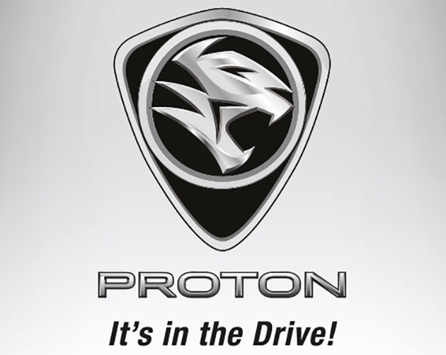
Proton has revealed a new logo, as seen on the brand’s Facebook page. The new tiger emblem also comes with a fresh tagline – It’s in the Drive!

As before, the new Proton logo’s dominating element is a tiger head inside a ring, and the emblem is in black and sliver. However, the “PROTON” lettering has been deleted, and the tiger head moved higher as a result. The ring is now thicker and looks to be more “3D” in appearance. New or old – which do you prefer?

“A new era, a new face. This new logo signals the beginning of a new era for all of us at Proton. It’s more than just a new face. It’s a new promise. A new attitude. A new commitment. Many do not know and have not driven our latest cars. It’s time they did. It’s time they knew who we are, what we stand for and how good our cars really are,” Proton said on its FB page.

Meanwhile, the new “It’s in the Drive!” motto alludes to driving pleasure, backed by characteristic good ride and handling, and the promise of new engines. Stay tuned for more big news from Proton today!

It's in the Drive

After 30 years of experience, learning, improving, and investing, we've reached a new dawn. An era that will have you know and think about us… differently. A new chapter that will bring you quality cars that deliver attractive designs. great value, and utmost safety. We've put our minds and hearts, along with millions of man-hours of research and development, into ensuring we produce cars that we are proud of. And cars you'll be proud to own. The proof will be in the driving. And there's no better way to convince you but for you to test drive our cars yourself. Therefore, along with our new PROTON logo, we now introduce as our new signature message: "It’s in the Drive!" Consider it our invitation to discover a new era of purpose, energy, innovation and focus. Welcome to the new PROTON.

Posted by Proton Cars on Tuesday, 16 February 2016

Looking to sell your car? Sell it with Carro.

Certified Pre-Owned - 1 Year Warranty

10% discount when you renew your car insurance

Compare prices between different insurer providers and use the promo code 'PAULTAN10' when you make your payment to save the most on your car insurance renewal compared to other competing services.

Car Insurance

Danny Tan

Danny Tan loves driving as much as he loves a certain herbal meat soup, and sweet engine music as much as drum beats. He has been in the auto industry since 2006, previously filling the pages of two motoring magazines before joining this website. Enjoys detailing the experience more than the technical details.


Comments

  • ionlaw on Feb 16, 2016 at 12:33 pm

    Drive sales figure up.

    Like or Dislike: Thumb up 3 Thumb down 19
    • hailthepurist on Feb 16, 2016 at 12:48 pm

      others say ‘its nothing in the drive!’..

      Like or Dislike: Thumb up 16 Thumb down 5
      • No, it should be “It’s in the Problem!”

        Like or Dislike: Thumb up 29 Thumb down 8
        • Same L0rrrr on Feb 16, 2016 at 4:57 pm

          Everything is improved but not the build quality. Good luck!

          Like or Dislike: Thumb up 6 Thumb down 3
      • OMG…funny tagline..sound weird. It’s in the DEAD…hahaha

        Like or Dislike: Thumb up 13 Thumb down 6
      • Songlap Songlap Malaysia on Feb 16, 2016 at 2:55 pm

        Why new logo? Very simple. Like everything else in Malaysia, it is the contracts that become valuable. The cucu, emak saudara, kakak ipar, kakak mertua, abang ipar, abang saudara of some DRB Hicom or Proton big shot will get this contract.

        Don’t underestimate. the contract alone is worth hundred over million ringgit to change the logo. Not just for the cars, the building logo, the stationary logo, eraser logo, pencil logo, sharpener logo, ruler logo ALL must change.

        For a company bleeding money and having very low sales, if the company is PRUDENT, they won’t do this now as it is a costly measure. But like I said, somebody in Proton or DRB wants to make $$$$$$

        Like or Dislike: Thumb up 28 Thumb down 4
      • Pro-Ton on Feb 16, 2016 at 3:38 pm

        Still the tiger?
        Auumm..

        Like or Dislike: Thumb up 2 Thumb down 1
    • George Abdul on Feb 16, 2016 at 12:51 pm

      I expect bigger changes, “Proton” word from above switch to bottom and the logo “tiger” get bigger with the ring. How many expenses on this “logo” alone? Millions?

      Like or Dislike: Thumb up 14 Thumb down 2
      • Potong Proton on Feb 16, 2016 at 1:55 pm

        Gotto delete the word ‘Proton’ as everyone hates it

        Like or Dislike: Thumb up 8 Thumb down 3
    • hahaha on Feb 16, 2016 at 12:55 pm

      last i checked its only a kitten only…. tiger went for topi…

      Like or Dislike: Thumb up 5 Thumb down 2
    • Donkey John on Feb 16, 2016 at 1:14 pm

      Meaningless and hopeless.

      Sack the designer!

      Like or Dislike: Thumb up 14 Thumb down 2
  • hakim on Feb 16, 2016 at 12:36 pm

    better to use the tiger and the ring only..this looks fugly..

    Well-loved. Like or Dislike: Thumb up 54 Thumb down 3
    • Better use the middle finger and the ring only… just like what they did to the rakyat for 30 years

      Like or Dislike: Thumb up 14 Thumb down 4
    • applegreen on Feb 16, 2016 at 2:48 pm

      that designer trace back thundercat logo and mirror it at opposite direction. Siap!

      Like or Dislike: Thumb up 8 Thumb down 1
    • hailthepurist on Feb 16, 2016 at 3:00 pm

      thats Maybank..

      Like or Dislike: Thumb up 7 Thumb down 2
    • PROTON=TONS OF PROBLEM :D on Feb 16, 2016 at 9:56 pm

      They’re trying to memeing lamborghini

      Like or Dislike: Thumb up 1 Thumb down 1
  • hakim on Feb 16, 2016 at 12:38 pm

    this looks fugly.. why dont they use just the tiger and the ring.. no need the shield

    Like or Dislike: Thumb up 31 Thumb down 3
    • ProtonGSC on Feb 16, 2016 at 12:43 pm

      Proton need more protection… 1 not enough now need “2” protection lol !!!

      Like or Dislike: Thumb up 5 Thumb down 1
  • frossonice on Feb 16, 2016 at 12:41 pm

    What the hell Proton!

    This is a con-job. Let see how design communities react to this and I’m sure it will be not good.

    Like or Dislike: Thumb up 4 Thumb down 1
  • drive malaysia people crazy

    Like or Dislike: Thumb up 19 Thumb down 0
  • Rashid on Feb 16, 2016 at 12:43 pm

    copy lagi….
    “EA Sports, it’s in the Game”
    improve quality & service dulu la…baru tukar logo…

    Like or Dislike: Thumb up 25 Thumb down 4
  • start a fight on Feb 16, 2016 at 12:44 pm

    Perdana launching today? let’s the party begin!

    Like or Dislike: Thumb up 0 Thumb down 4
  • contender on Feb 16, 2016 at 12:45 pm

    Stop wasting money on this unproductive makeovers ….. focus on your product development improvement Proton !

    Like or Dislike: Thumb up 8 Thumb down 2
  • JonLabu on Feb 16, 2016 at 12:46 pm

    EA Sports..It’s in the GAME!

    Proton…It’s in the DRIVE!

    Like or Dislike: Thumb up 12 Thumb down 0
  • karam singh on Feb 16, 2016 at 12:47 pm

    the old one in the first Saga of 1986 is a lot better – it is illuminated at night. better than BMW or Mercedez Benz.

    Like or Dislike: Thumb up 19 Thumb down 0
    • Horizon Sailor on Feb 16, 2016 at 6:09 pm

      I agree..The old crest is better than this mirrored thundercat.

      Like or Dislike: Thumb up 0 Thumb down 0
  • JonLabu on Feb 16, 2016 at 12:47 pm

    EA Sports…Its in the GAME!

    Proton…Its in the DRIVE!

    Like or Dislike: Thumb up 1 Thumb down 0
  • paul fan on Feb 16, 2016 at 12:50 pm

    I feel if it follows Holden or Vauxhall design it would be greater.

    Like or Dislike: Thumb up 1 Thumb down 0
    • alldisc on Feb 16, 2016 at 1:26 pm

      already did that, with Waja. look closely and it actually has similarities with Vauxhall of the late 90s like Astra and Zafira.

      Like or Dislike: Thumb up 0 Thumb down 0
  • Gotto copy Toyota lolz

    Like or Dislike: Thumb up 9 Thumb down 1
  • nabill (Member) on Feb 16, 2016 at 12:51 pm

    Its in the service center

    Like or Dislike: Thumb up 17 Thumb down 1
  • jibby martha focker on Feb 16, 2016 at 12:54 pm

    Tiger + Shield or Tiger + Ring. No rojak please.
    You may ask Theo to render you a new one!

    Like or Dislike: Thumb up 8 Thumb down 0
  • FIST (Member) on Feb 16, 2016 at 12:57 pm

    In the drive jugak

    Like or Dislike: Thumb up 0 Thumb down 0
  • hafiz on Feb 16, 2016 at 12:59 pm

    I think, need to more improve or develop emblem ring and a logo tiger it ok right now…^^ gd job.

    Like or Dislike: Thumb up 0 Thumb down 0
  • They should use bahasa…
    “Pandu di dalam”

    Like or Dislike: Thumb up 9 Thumb down 1
  • anoncar on Feb 16, 2016 at 1:02 pm

    I wish they’ve use the tiger portrait from the front with the circular orb encapsulating it. A symmetry logo would make it more organic and pleasant to look.

    Like or Dislike: Thumb up 1 Thumb down 0
  • Same L0rrr on Feb 16, 2016 at 1:04 pm

    New logo can not give high RV!

    Like or Dislike: Thumb up 0 Thumb down 0
  • James Vincent on Feb 16, 2016 at 1:05 pm

    Lol… they rebadge mitsibishies and hondas…now they changing other companies logos to suite their needs ..
    Ea sports “it’s in the game” …lol

    Like or Dislike: Thumb up 5 Thumb down 0
  • Jimmy on Feb 16, 2016 at 1:07 pm

    Proton’s Lotus ride and handling is good and real.
    Go and test drive to believe.
    But, please lah, your CVT is very noisy.

    Also, the shield is redundant (ugly); ring + thundercat will do.

    Like or Dislike: Thumb up 12 Thumb down 0
    • Atilla on Feb 16, 2016 at 1:21 pm

      A go cart’s handling is also good lah. It’s about everything they can do well not just one area that makes or breaks a good solid car.

      Like or Dislike: Thumb up 1 Thumb down 0
  • Atilla on Feb 16, 2016 at 1:09 pm

    Ehh that tagline sounds like the Toyota “It’s all about that drive” campaign that’s going on right now. I guess when you have nothing else to highlight you talk about “the drive” haha

    Like or Dislike: Thumb up 7 Thumb down 0
    • Like paultan reviewer said, “if there is one thing that P1 excel, it is in the drive. Brilliant. That’s it”.
      So, yeah.. it’s in the drive. Correct tagline.
      For the logo, the new one is better.

      Like or Dislike: Thumb up 4 Thumb down 8
  • When the designers of the logo cannot decide between using just the ring circle or the outer lines, they just use both.

    Makin lama, makin menjadi bahan lawak proton ni.

    Like or Dislike: Thumb up 5 Thumb down 0
  • sepul on Feb 16, 2016 at 1:23 pm

    Always prefer the diamond and 14 pointed star used in UK Wiras of old.

    Anyway, compared to this new logo, the current one is much, much better. Why it look like MS Paint drawing?

    Like or Dislike: Thumb up 2 Thumb down 0
  • Matchy on Feb 16, 2016 at 1:27 pm

    I feel that the flat look of the old logo is nicer… 3D look is so 90’s/early 2000!

    Like or Dislike: Thumb up 0 Thumb down 0
  • John Doe on Feb 16, 2016 at 1:41 pm

    Just die and go Bankcrupt already,you darn abomination !

    Like or Dislike: Thumb up 10 Thumb down 3
  • Proton haters everywhere

    Like or Dislike: Thumb up 8 Thumb down 14
  • policeman on Feb 16, 2016 at 1:42 pm

    The shield represents the protection it received all these time.

    The ring shows that it cannot be break out to be a global player and is still somewhat a jaguh kampung.

    The tiger with its mouth open represents the end. The tiger is aware of its imminent death. It will try to defend itself till the end. Hope will fade.

    Let’s poke the tiger!

    Like or Dislike: Thumb up 11 Thumb down 3
    • don't think we r stupid, proton! on Jun 19, 2016 at 10:32 am

      This was the best comment i’ve read mr.Policeman. Let’s poke the tiger! lol

      Like or Dislike: Thumb up 0 Thumb down 0
  • Ollie on Feb 16, 2016 at 1:43 pm

    Good. Great. Yes, lets get people to test drive. Sit inside and feel the plastic quiver under one finger pressure. See the labels that will fade after 3 months. See the buttons that will fall off after 6 months. Hear the engine that runs on petrol but sounds like a diesel.

    Then, go to your nearest used car dealer, and test drive any Toyota, Honda, Mazda, Nissan (not Almera), Kia, Hyundai and Ford. For the same price, dear Malaysians, you’ll have a car you won’t die in and that won’t cost you thousands to maintain and won’t break down on you. Please. Just do it.

    Like or Dislike: Thumb up 5 Thumb down 3
  • Shelby on Feb 16, 2016 at 1:44 pm

    I thought the tiger already been hit at LPT

    Like or Dislike: Thumb up 1 Thumb down 0
    • John is Otak Batu on Feb 16, 2016 at 2:32 pm

      Yeah… it will end that way! Like it still don’t know what hit them.

      Like or Dislike: Thumb up 1 Thumb down 0
  • Muhammad on Feb 16, 2016 at 1:49 pm

    Because they is nothing good from proton so it’s in the drive which means nothing. Proton you shud change yur tagline to ” We are sorry, thank you for your support for the past 30 years, we are officially closing down to end your suffering”

    Like or Dislike: Thumb up 0 Thumb down 2
  • eims perfume on Feb 16, 2016 at 1:55 pm

    prefer shield + tiger head minus the ring.

    Like or Dislike: Thumb up 3 Thumb down 0
  • hmmm,proton should remove the sheild lah,its like a logo that’s not complete with the shield,let the ring alone btw the tagline is most suitable for the good handling from proton cars,thumbs up

    Like or Dislike: Thumb up 1 Thumb down 3
  • smokey on Feb 16, 2016 at 2:12 pm

    prefer the old one
    or, just the ring and tiger without the shield

    Like or Dislike: Thumb up 0 Thumb down 0
  • Proton on Feb 16, 2016 at 2:46 pm

    Remove the shield and maintain only tiger in the ring. Will look more nice

    Like or Dislike: Thumb up 0 Thumb down 0
  • Jobless on Feb 16, 2016 at 3:12 pm

    Broken English…drive it to believe it…feel it…all broken English …Proton u cannot even get yur English words correct pls pay more to hire REAL advertising people

    Like or Dislike: Thumb up 2 Thumb down 1
  • superman on Feb 16, 2016 at 3:33 pm

    ugly logo. just omit the shield and use the ring only then it looks better. who designed this ugly logo. the old one was better balanced… another screw up design by Proton styling Gods!!!!

    Like or Dislike: Thumb up 1 Thumb down 0
  • Ihatecopycat on Feb 16, 2016 at 4:15 pm

    Thunder..thunder.. Copy Cats

    Like or Dislike: Thumb up 1 Thumb down 0
    • Nancy on Feb 16, 2016 at 4:50 pm

      The designer must be from Thunder cat era. Make it simpler so that can reduce few ringgit on the car price. By the way current logo also faded very fast

      Like or Dislike: Thumb up 1 Thumb down 0
      • Horizon Sailor on Feb 16, 2016 at 6:05 pm

        Thunder…Thunder…Thunder cat….hooooooooooo…..!!!

        Like or Dislike: Thumb up 1 Thumb down 0
  • albag on Feb 16, 2016 at 4:43 pm

    apa harimau lagi, dah jadi kucing lettew

    Like or Dislike: Thumb up 1 Thumb down 0
  • to2olde on Feb 16, 2016 at 5:00 pm

    Whatever logo you put in or designed by a top name, the Proton name is stale already. Even big three automakers in Japan are already feel the heat at the moment with autonomous cars..Tesla, Volvo, Google, Apple. How is Proton going to keep up with the high tech onslaught??

    Like or Dislike: Thumb up 1 Thumb down 0
  • Gandhi on Feb 16, 2016 at 5:14 pm

    EA SPORTS – ITS IN THE GAME
    PE-RO-TON = ITS IN THE DRIVE

    Awkwardly similar

    Like or Dislike: Thumb up 0 Thumb down 0
  • Aero (Member) on Feb 16, 2016 at 9:33 pm

    Sooo…. basically what Proton just did, is to use a slightly modified 3D version of their Taiwan-spec export badge ?

    Proton cars that were exported to Taiwan (ROC) had different badges. No other country got this badge, only Taiwan did.

    This is what it looks like ; https://www.flickr.com/photos/83468718@N06/14884674825/

    The reason why is because there was already another company in Taiwan called ‘Proton’. And our Malaysian Proton could not secure the rights to use the ‘Proton’ name in Taiwan. Proton-Lotus was used instead.

    Not many know this, but now you do. :]

    Also, I think the new badge is fine, but the ’empty space’ under the ring looks weird. But I’m sure it will look fine on the front grille. When the new ‘tiger’ badge came out on the Waja, I didn’t like it either, but I got used to it. My favourite badge has to be the good old ‘Iron man’ Saga badge from the 1980s, the one that lit-up blue in the night. haha

    Like or Dislike: Thumb up 0 Thumb down 0
  • go to Google.com image search then type in Combofix. You can see current Proton tiger head logo is almost identical with Combofix software. It’s just that the tiger head is facing different direction…

    Like or Dislike: Thumb up 0 Thumb down 0
  • EA Sports, it’s in the game…

    Like or Dislike: Thumb up 0 Thumb down 0
  • backwards proton on Feb 17, 2016 at 9:33 am

    Shows how backwards their mindsets are.

    The new trend now in logo is to make it simple, and flatter (no shadows/embossed/shading etc)

    Proton on the other hand is going backwards, making things more complicated in their logo and adding all the 3d effects etc.. That is so 2000.. get with the time!

    Like or Dislike: Thumb up 2 Thumb down 0
  • Carroll on Feb 21, 2016 at 6:15 pm

    New logo certainly not an improvemet, but it won’t mean anything here in the UK anyway.
    Proton UK were slowly dying on their feet for years and hav’nt sold a car since 2011…

    Like or Dislike: Thumb up 0 Thumb down 0
 

Add a comment

required

required