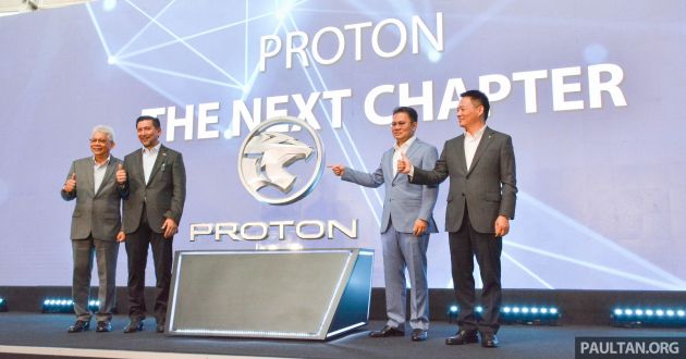
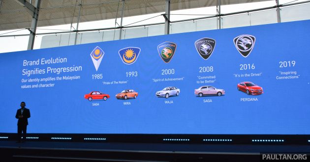
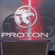
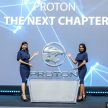
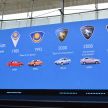
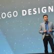
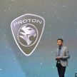
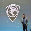
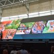
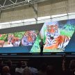
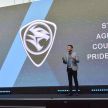
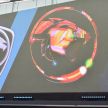
Proton today launched its revamped corporate identity as part of an evolving strategy to become a global and modern automotive brand, which saw the unveiling of a new logo and tagline.
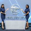
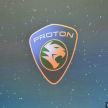
Compared to the previous logo, the new one drops the outer “shield” altogether, with just a circular emblem surrounding a redesigned tiger head that looks bolder than before. The tiger head, which Proton says is now “uncaged,” has different levels of shading to give it a sense of depth, and enters the circle from the left side.
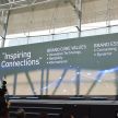
To go along with the logo, Proton also announced a new tagline, “Inspiring Connections,” which the national carmaker says “encapsulates the brand’s aspiration of utilising technology and mobility to help make human connections that inspired a successful life.”
“For us, branding goes beyond our logo, tagline or colours. It’s about what our company stands for and is known for; it is our company’s commitment to our consumers,” said Li Chunrong, CEO of Proton Holdings.
“This is why we did not rush to launch our new branding when we began our journey in 2017, but instead we focused our energy on solving customer issues, making a better product, upgrading our dealer network and restoring customers trust. That is our commitment and our brand,” he added.
This tagline is driven by three core values: innovative technology, reliability and international. The first is self-explanatory, with the carmaker stating its commitment to develop products with the most innovative technologies available, incorporating global R&D and Geely’s iNTEC platforms.
In the case of reliability, this covers products as well as aftersales service. The latter is exemplified by its efforts to improve its dealer network, which currently stands at 102 3S/4S centres in Malaysia, along with adhering to high standards of service. Lastly, international refers to the brand’s ambition to be one of the top three automotive manufacturers in the ASEAN region.
“The modern automotive industry, like many other industries today, must adopt a global and international mindset. Global partnerships. Global supply chain. Global standards. Global talent,” commented Datuk Seri Syed Faisal Albar, chairman of Proton Holdings.
“This is what the Proton of tomorrow will stand for, and we are proud of our evolution because we are taking the journey to the next level. Proton will continue making the best cars that meet Malaysian needs, make no mistake, but we will do this as a globally-competitive company,” he added.
With all said and done, Li confirmed in a press conference following the launch that the locally-assembled (CKD) version of the X70 SUV will be the first model to bear the new logo. According to Yusri Yusuf, senior director, Proton corporate strategy, other (current) models will also be fitted with the new logo when they are updated later on.
It’s a busy time at Proton, as the company launched five new models – X70, Saga, Iriz, Persona and Exora RC – in a span of eight months, while improving its dealer network. The company is also proud to be the only major manufacturer (based on its internal data) to achieve double-digit growth (36%) in 2019, up until now.
Looking to sell your car? Sell it with myTukar.
Hail hydra!
Be the heroes! Roar like tiger! Brave like thundercats! Buy Proton Hohhhhh!!!!
I have done logo change for a company this size. In total, it will cost about RM20 million
Well done Proton for wasting this money. Might as well give the rakyat cheaper cars and use the RM20 million to subsidise us.
How about you work harder instead of asking for handouts?
Cina everything got fake … Now got fake Proton too
Brand values ? What brand values ? A joke in the Auto industry and bastardised brand.
Give us a reason why need to subsidize you?
oh boy, you must be overpaid only moron will pay RM20 million. Logo design can be done in-house.
Thundercats
Toothless?
Classy! w/o the shield
ROAR!!!!!
wah! more garang thundercat logo!
LOL, so much BS.
Other carmakers are simplifying their logos while Geely still wants a complicated 3D looking one.
why so negative? Porsche and Alfa logo is so complicated and annoying yet you forgot to bash? so much BS.
Got selective memory, what to do….
Honestly speaking this is pretty simple. To go further would be to sum up the logo using the carmaker’s initials, like Toyota/Honda/Hyundai/Perodua/etc. But Perodua already has dibs on a ‘P’ logo.
The shield was overkill, remnant of the antiquated thinking of the previous management that drove the company into the ground. Geely is making serious strides with their management, hopefully we’ll see more in the future, let Proton’s embarrassing past be buried with time.
Tahniah P1! Continue to inspire new generations of MY pipu. Inspiring Connections reminded me of Nokia Connecting Pipu, now cars not just for transport pipu but even have constant connectivity via P1GKUI. P1 has gone beyond offering just cars to customers but now gips a lifestyle statement to them. Kudos to P1!
Choi, pantang lah woi. Use Nokai is bad example. You want Proton to die ah???
Nokia mobile phone business was eventually sold to Micro$oft due to loss of sales and poor management decisions not to embrace Android.
Nokia die becoz they din change, they were angkuh becoz they were No1. Just like P2. This not like P1, alwiz change, alwiz adapt, alwiz knows what their customers wants, and their customer wants something more than just lousy specs they see inside P2, which is what P1 is now gip really gud stuff. Despite the brand gone liao but the name still remains. P1 can do better than that and reach for the stars.
P1 was also angkuh at one time. From mid 90s to the mid 2000s. That when it was number one.
Angkuh was their ex-advisor and crony chairman.
Remember Nokia is trying to do a comeback.
Hoooooooooooooooo
thunder cat logo
Thunder cat!
Tak nampak macam rimau.looks more like fox
Eyes problem
with your eyes, even a duck will look like chicken.
Bro Danny. To him, if it looks like a duck, quacks like a duck, swims like a duck, then its most likely a chicken.
Sorry Proton but this newer tame cat logo somehow doesn’t roar like the older Thudercats logo.
But it is uncaged…
Inside a cage got 2 heads also no use… lah..
Take the positive…
Thunder… thunder… thunder… thunderCAT!
Congrats DRB and Proton on the big achievement.
i still think the first 1985/1993 looks the best, very unique, very simple
i also the trend now is to move to simpler, clean, flat design…but proton add complexity with the 3D different shade design…and tiger are yawn
Radar / lidar compatible?
One thing that i truly truly don’t understand about Malaysians or Malaysian companies. You know logo designing isn’t youre forte, why wouldn’t you engage a well known designer to design your logo? Why hire some half baked chap to do the job? You want your products to sell internationally but your logo is like a design from a high school competition. Google “tiger logo” and you’ll see how many great designs out there and look at this new proton logo. Damn sad and stupid looking.
I think you are the one whom lacking the knowledge about logo design. They cant just redo the whole logo to be totally different. Try to look closer at the tiger head, all the cranny and nook is still there, just refined here and there. This gives the logo not just a new look but also a familiar feeling and attachment to the old logo.
Looking like Jaguar. May eventually under same branding ?
Meow meow..
Its easy to achieve a staggering growth of 36% when you started from below. Lol. The real challenge starts now. Kipidap proton
Its easy you achieved a staggering growth of 36% when you are from the bottom level. The real challenge starts from now. Kipidap proton
they just realize that all successful manufacturer are using round/oval shape…theirs so called diamond don’t bring any ‘ong” anymore…
so Porsche, Lambo, Ferrari, Koenigsegg is not successful due to ‘diamond’ shape? did you left your brain somewhere?
to be honest all the car makers you quoted were luxury brands.
From tiger wannabe to paper tiger now.
Still tiger. Unlike someone from then until now still bargain basement keyboard warrior.
Logo pelesit Bikers
The tiger design should have been bolder- in fact the previous design was already good in my opinion. I do support the circular emblem rather the old caged shield design .
logo Harimau Melaya
Can Naza please refresh, no, throw their logo away? Fugly as ever. Oh wait, theyre no longer relevant….
Thundercats will sue proton have to pay for the compensated !!
Thundercats facing right, proton facing left. Technically, proton not copying tandaket
Dapat tambah horse power ni
We all know they have no place among the world brands as they are only rebadge CKD China cars the stays of full oem is no more relevant. After 30 years rebadge geely Chinese cars not even legal in Europe and USA .
P2 sales bad ah this month? So free one. Kan Axia selling like karipap panas.
Eeeeuuuwwww! Yuurrkkk!
Ahh Siti.. I always love your comments. Such insights. Don’t worry, this is a phase for you as it was for me when I first saw Bezza. I was like “euuww! werkkk!! ugly! I will not buy one of those! ever!”. And looky2 here I’m an owner of a Bezza. So, it’s ok, barf all you want but remember this, “never say never”.
well done, Geely
the case of reliability, this covers products as well as aftersales service. The latter is exemplified by its efforts to improve its dealer network, which currently stands at 102 3S/4S centres in Malaysia, along with adhering to high standards of service.
Well, proton if you noticed the JD power report you are still dead last. All the existing SCs and especially the newly added ones 3S/4S basically know pretty much nothing at customer service+automotive after sales.
The grave is getting deeper now.
You’re probably not a kind of person who usually get involved in restructuring / revamping a whole department. Well, lucky for you I’m here to help. I have vast experience in these kind of stuffs and hold a high position as well. One thing I can tell you that in my company, whenever we do restructuring, we make sure that we have a plan for EVERY DIVISION. Long story short, if I’m in a board of management, I will not support any plans to upgrade service centers to 3S/4S unless the plan to upgrade / improve / replace “the customer service+automotive after sales” are not included. Therefore, my assumption that since P1 has been doing well since Geely, I do not think the 3S/4S upgrade doesn’t come with an internal improvement plan for the “customer service+automotive after sales”. But, HOW would I know what happens in the BACKGROUND.
The change of logo, although may sound superficial, at least indicate the will to change. This time, make us proud!
Go Malaysia! Go thundercat!
All brand car walking away from logo..please focus on giving reasonable car price for local car..that’s all..
Logo 1985 paling terbaik!
Okay now we can see the tiger clearly
ThunderCat
Is like copy a bit Thundercats, then copy a bit Maybank…. no more originality… still prefer old proton logo in the 80s and 90s
I like the previous logo better. This looks good but the previous one looks more aggressive and much more appealing to me. The current one looks like something out of the 80s kid’s cartoon show.
PS: I don’t know why there are still people who can’t see the tiger in the previous logo and make an issue out of it.
Predict Malaysia vehicle sales data for August 2019 by brand:-
1. Perodua @ Mumm-Ra – 19500 units
2. Proton @ Thundercats – 9127 units
3. Honda – 7500 units
4. Toyota – 5500 units
5. Nissan – 2000 units
Ah…. Logo change cause different owner…. BMW Toyota Honda and other else same logo from benninging… Ahahha
BMW; maybe yes but are you sure about the other two? And to claim “same logo from the benninging”?
This is not a new Logo. This logo was originally in Black colour with a fill of red colour in the background of the circle. This Logo was originally a crest of an ancient Royal Family from the destroyed world of Thundera.
This symbol was known as the Eye of Thundera. It was an emblem used by the aristocratic royal family of alien cat like people known as the THUNDERCATS.
Thundercats join Proton