
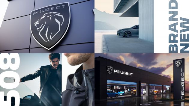
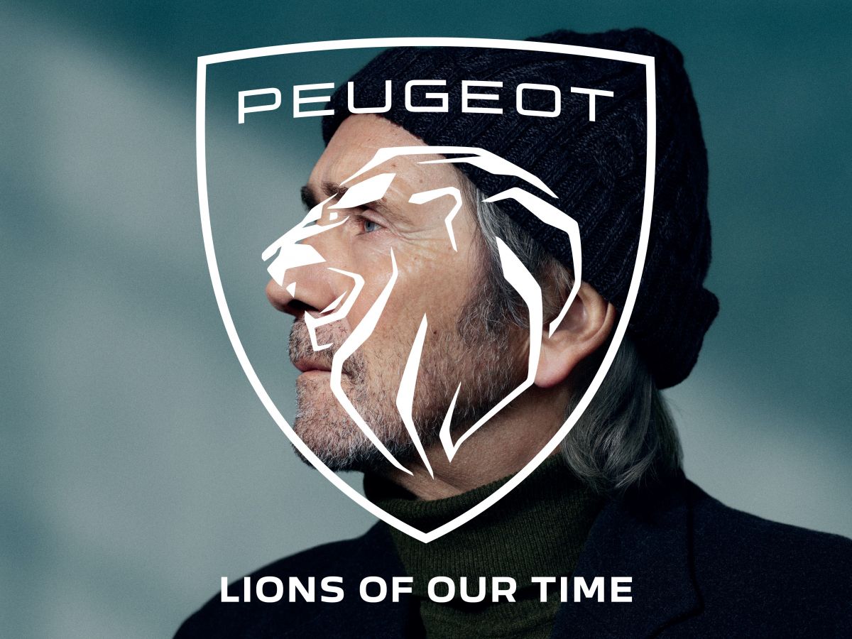
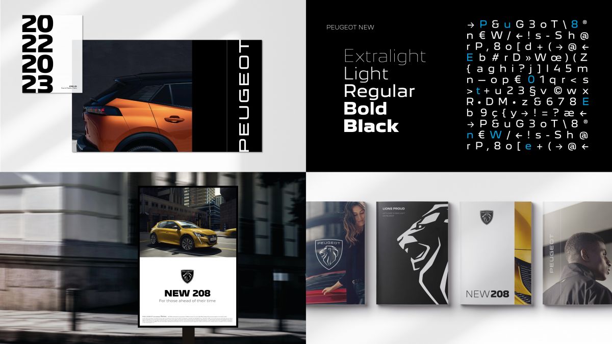
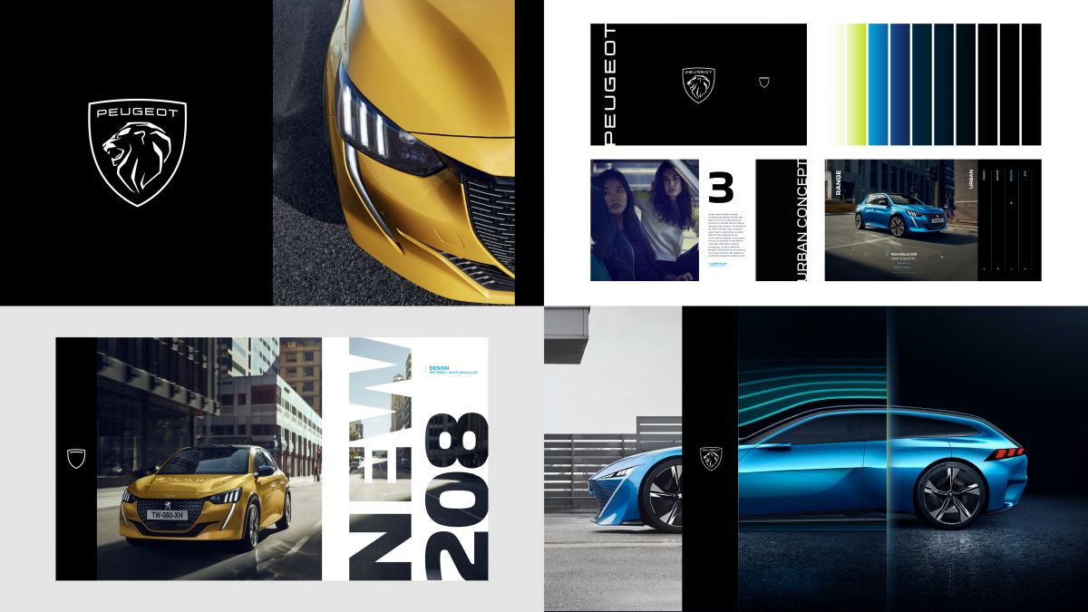
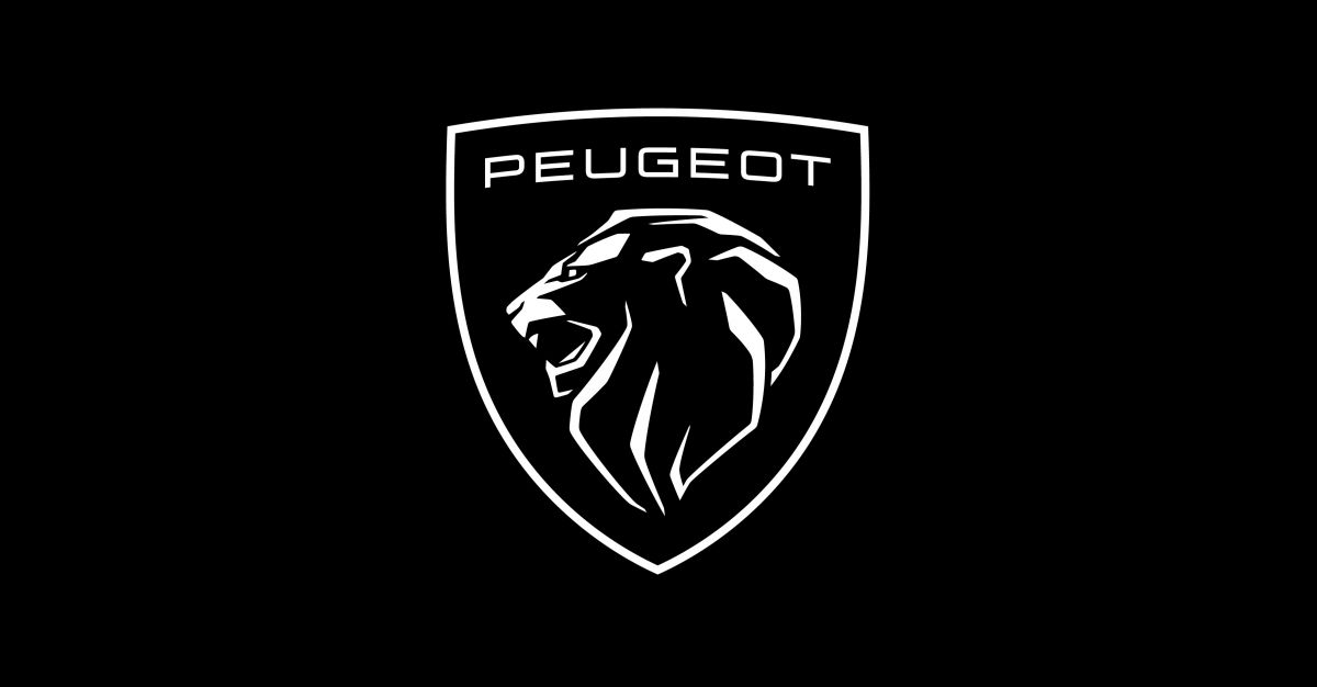
Peugeot has unveiled its new logo and brand identity that is in line with its move upmarket towards becoming ‘high-end generalist’ and with a new focus on customer touchpoints. The latest logo is the 11th to emerge from the French manufacturer, with all 10 prior logos bearing the imagery of a lion since the first in 1850.
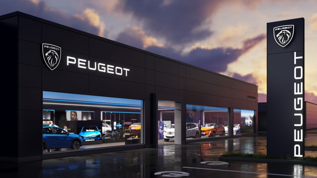
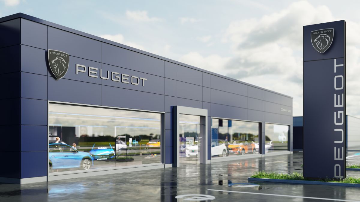
The new brand identity will initially be rolled out in the brand’s communications material as well as dealerships, with around 20 flagship outlets worldwide to wear the new identity by the end of next month, and be adopted by 1,500 dealerships by the end of 2021, said Peugeot marketing and communications director Thierry Lonziano. All dealer locations worldwide will be completely rebranded by 2023.
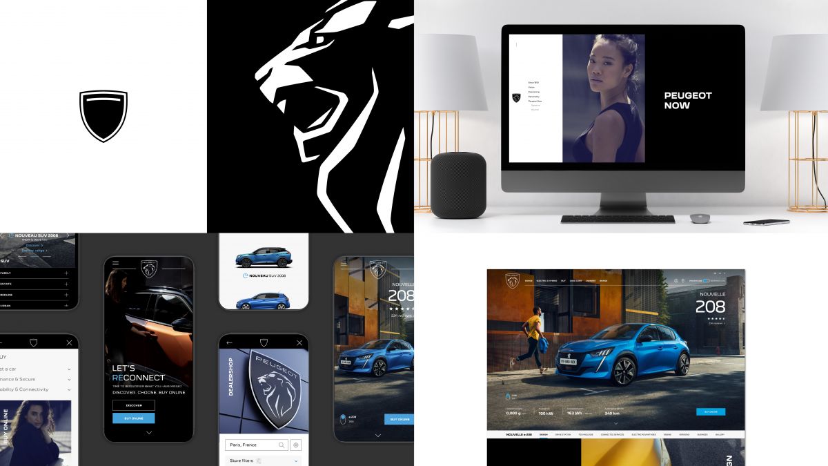
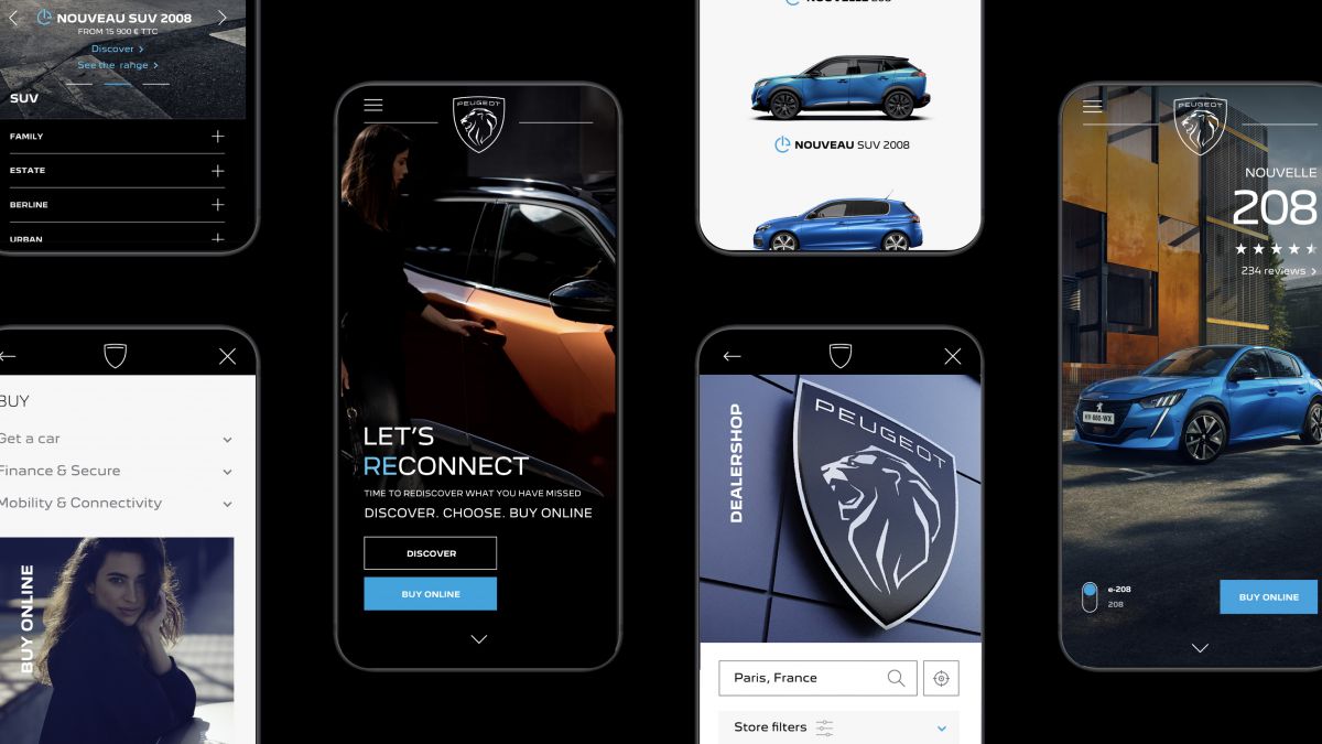
The brand’s new thrust is to “turn time into quality time” for the customer, and the theme extends to the brand’s websites, where the user experience is described as simplified, like the logo, as well as more immersive and intuitive, said Lonziano. The online processes for vehicle sales, as with other areas of customer experience, have been streamlined as well, said Peugeot CEO Linda Jackson.


The next-generation Peugeot 308 will be the first car from the French brand to wear the new emblem, and the C-segment model’s styling can be expected to be brought in line with Peugeot’s most recent products such as the 2008, 208 and the 508.
The new identity is a bridge between the brand’s history and the vision of Peugeot’s future, said Peugeot design director Matthias Hossann. As for the reason, the rebranding exercise “has absolutely nothing to do with Stellantis; we started working on [the rebranding] a long time before we even starting thinking about Stellantis,” Jackson said, referring to the merger of Groupe PSA and Fiat Chrysler Automobiles.
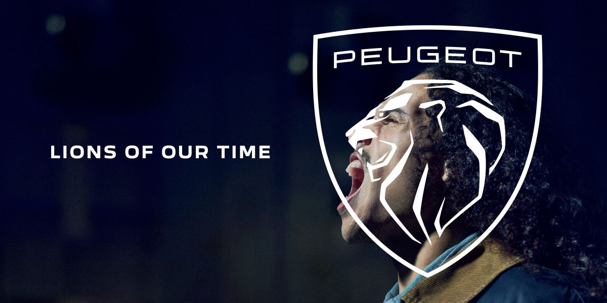
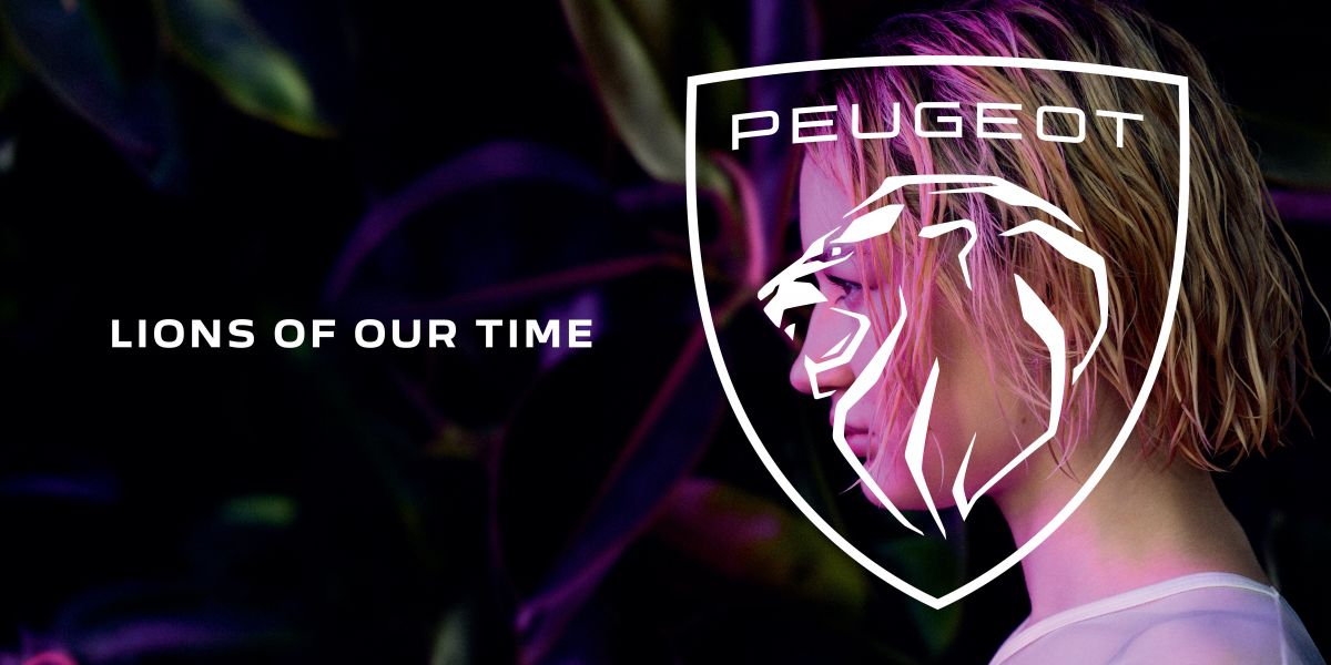
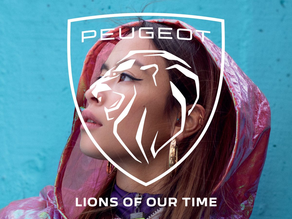
As we have seen with the logos of other automaker brands such as BMW, Nissan and Volkswagen, Peugeot’s move to a flat, two-dimensional design is to facilitate its use on digital platforms. Peugeot has found that “now is the perfect time” to switch to a flat design as its logo will be more widely used across digital assets, said design director Hossann.
Looking to sell your car? Sell it with Carro.
 Peugeot 408
from RM 146,055
Peugeot 408
from RM 146,055  Peugeot Landtrek
from RM 120,072
Peugeot Landtrek
from RM 120,072  Peugeot 2008
from RM 134,103
Peugeot 2008
from RM 134,103  Peugeot 3008
from RM 169,388
Peugeot 3008
from RM 169,388  Peugeot 5008
from RM 186,288
Peugeot 5008
from RM 186,288
Peugeot Lion + Proton Tiger. Peugeot PSA always the best saviour of our ailing Proton, since years of sub-par cars, poor after-sales service and tough competition.
This reminds me of the older Proton logo. Wish Proton brought back the early 2000s blue/green tiger logo. It was so cool and really stood out.
NAZA dajjal peugeot, DRB dajjal suzuki. Siann
Doesn’t this new peugeot logo looks kinda similar to previous proton logo? lol..
more mature… BUT a bit old school
What is this? Foorball Club’s coat of arms? Previous Proton inspired logo?
This is actually a revived old Peugeot logo from the 60s. So, I think it’s Proton who actually got inspired by Peugeot instead
……….and all modern tyres inspired by mesopotamian ancient wheel
They revived their 60s logo! Awesome! Their current lineup is amazing, the new logo is a good move.
Thought it was proton at first…
adui … so much a mirror image of Plotong ThunderCats logo
Hello,the Peugeot logo now resembles the Proton tiger with long hair…are the French doing a copy ,alter n paste job?
Well in fact it’s a revived old Peugeot logo from the 60s.. so Peugeot came with it first..
Please don’t shame yourself. At least search for “Peugeot logo history” on the web before commenting.
Improve your product quality and after sales service first. Dont talk cock. 1 single 1.6 turbo prince engine for entire peugeot car models. WTF.
Proton inspired logo.
I always love their original logo, so class and prestige but not their quality and after sales service.
Looks like previous Proton logo
Singapore is proud
Singapore national car project? :D
“These lions…these lions represent a profound change in our times” CEO of Peugeot.
Looks exactly like Proton’s lion.
Good direction. Unlike the Proton, mentioned Hybrid by centuries!
Feel like Scania
The logo clearly resembled and copied former Proton logo…how’s that Geely???? :)
The lion versus the tiger….
that’s nice but could easily be mistaken for a football club logo!
A lot nicer look in my opinion.
New design to facilitate digital platform… Hard to click. Can anyone help me understand this?
peugeot: launches new logo
proton: haha
Ok, don’t tell me that most of the people who comment “looks like Proton logo” or “copy of proton logo” have their internet controlled by a firewall where they can only surf for PT website and are not able to do a google search at all? Peugeot history is way older than Proton and they have changed their logo many times. Look it up! In case you don’t know how to search, try “evolution of peugeot logo”. Don’t be such a lazy a**ho*e!
Peugeot came out with this Logo in 1960’s probably Proton copied it, since Peugeot changes its logo from time to time.
actually it looks like SIngapore merlion head logo