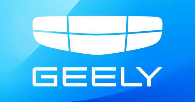
At the start of the year, Geely Auto introduced its new logo, which it says “signifies our all-new brand aspiration to be more open and unlimited in the future.” The latest insignia is an evolution from the previous two iterations of the carmaker’s logo, taking on a flatter and simpler look that features just a white shield made up of six panels divided by horizontal and vertical lines.
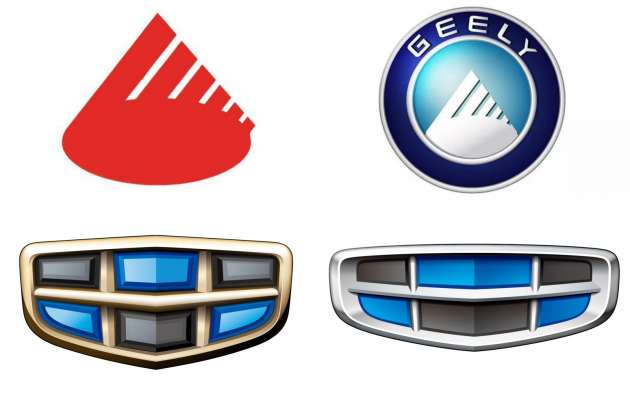
The previous Geely Auto logo marked the company’s fourth era of development (Innovative Geely 4.0) in 2020 and featured silver trim surrounding black and blue segments. This is said to coincide with the development and release of new models based on the BMA (B-segment Modular Architecture), CMA (Compact Modular Architecture) and SEA (Sustainable Experience Architecture) platforms.
Prior to this, the company’s third generation of vehicles (Refined Cars 3.0) that kicked off in 2013 saw the use of a more compact logo that still featured black and blue panels, albeit joined by gold trim for the shield. This was the first use of the coloured panels, which “which represent the earth and sky showing the brand’s hope of seeing its products traveling around the world and its ambition to reach for the skies.”
Going back further in time from 1998 to 2007, the Geely Auto logo was a roundel that had an outer blue circle symbolising “that which lies beyond infinity and the universe” with the company script in white. The inner circle had the silhouette of a mountain in white on a sky blue background, the latter symbolising the “vast blue sky and infinite possibilities of the company” as it entered the automotive industry.
The mountain silhouette seen in the second iteration of the Geely Auto logo was originally found on the very first logo used when Geely was incorporated by its founder Li Shufu in the early 1990s.
According to the company, the red mountain silhouette was reminiscent of those found around the Geely’s original hometown of Taizhou in the Zhejiang Province and signified the solid foundation of Geely and its people. The design of six slanted lines was actually made up of six sixes, which is a reference to a famous Chinese idiom “liùliù dà shùn,” that implies “everything will be smooth.”
The minimalistic approach to the design of Geely Auto’s latest logo is not uncommon in the car world, as other brands such as Nissan, Kia, Volvo, Volkswagen and BMW have also done the same.
Looking to sell your car? Sell it with Carro.


Owh inspiration from the rear view mirror
Geely should get some inspiration from the merpati’s wife who got back all her Diamonds n birkin handbags.
Sure got gaya,mutu,keunggulan ,the new design,Geely..look no further to other designers.
Cadillac logo says hi apa khabar.
Soon, all Proton cars will use this logo, might as well just rename Proton into Geely
They are pretty much a distributor by now, so you’re right bro
Yup truly a National embarrassment.
Hahaha nice one Silthice.
When will Proton rebadge Geely EV? We are so far behind compared to other countries.
Microsoft Windows Geely
Don’t forget the early 2000s’ logo styled after Toyota’s sobrero…., embellished with curved lines, all within the oval. The court apparently put an end to that one.
Eww Geli
can’t chinamen really come out with something original? aiyah…….everything oso copy
i have never seen one chinamen company with nice logo design…….they’re like designed by retarded or they simply have very bad taste, or they just copy
copy, modify and improve…that’s the way to move forward without wasting time…but must copy things which are good…
send the brief back to the agency… tell them to try harder please