
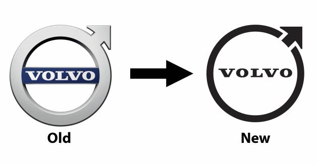
Volvo has introduced a new design for its famous Iron Mark logo, which appears to have been rolled out to all divisions of the Swedish carmaker, including here in Malaysia. Compared to the previous design, the new logo is a lot simpler with its monochrome style, although it continues to use the same font type as before.
Elsewhere, the centre bar that frames the script is now gone, while the ring is now slimmer and no longer sports a 3D effect. The all-important arrow pointing to the upper right gets the same treatment and results in the circle not being fully closed; fun fact: the circle with an arrow pointing out is an ancient symbol for iron.
Reports indicate that Volvo will continue to use the older, blue-accented logo on its vehicles through 2022, before all its cars make the switch to the new design from 2023 onwards. However, there doesn’t appear to be an official press release (yet) that talks about the new logo.
Volvo’s focus on simplicity when it comes to logo design is something we’ve seen before, as Volkswagen, BMW, Nissan and Renault have all made the switch to a flatter approach. What do you think of the new Iron Mark?
 Volvo ES90
from RM339,888
Volvo ES90
from RM339,888  Volvo XC60
from RM328,888
Volvo XC60
from RM328,888  Volvo XC90
from RM418,888
Volvo XC90
from RM418,888  Volvo EX90
from RM442,888
Volvo EX90
from RM442,888  Volvo EX30
from RM208,888
Volvo EX30
from RM208,888  Volvo EC40
from RM248,888
Volvo EC40
from RM248,888  Volvo XC40
from RM268,888
Volvo XC40
from RM268,888 
is this a sign that volvo has given up?
They are doing well now compared to any other time in their history. Why would they give up.
IMO, this new logo goes better with their modern design and will be a place for their future Lidar/radar placement!
Did VW gave up after changing their logo?
Pity the dealers who will have to spend money upgrading to the new CI.
As beautiful as MAN logo
Too plain..not inspiring..like third world country..with state of the art computers,Volvo can do better ,right?