Volkswagen Passenger Cars Malaysia (VPCM) has put up a teaser video on its social media pages, but it’s not of a new model. Instead, the video shows the familiar Volkswagen logo morphing into a new, flat version that made its debut in September 2019 at the IAA motor show in Frankfurt.
This is a sure sign that VPCM will soon be adopting the new logo and corporate identity. With the CI transition, expect a new look, and the new 2D logo of course, for the brand’s dealerships and communications in our market. Wolfsburg is calling this the “New Volkswagen”, marking the start of a new era for the carmaker.
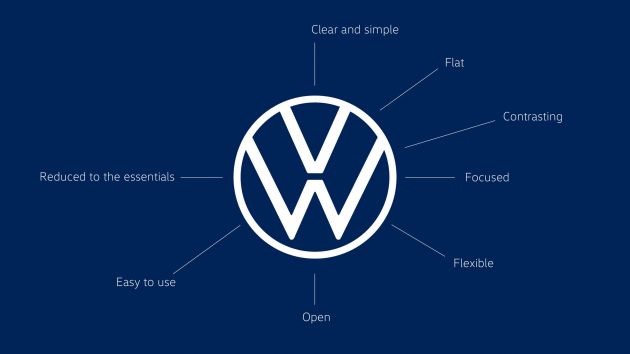
Volkswagen says that with the new brand design, it has created a uniform global 360-degree brand experience which is more modern and more authentic. The new VW logo makes the change from 3D to a flat two-dimensional design, which is clearer and reduced to its essential elements.
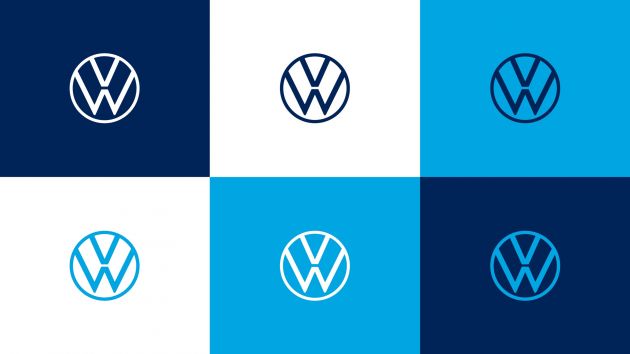
In addition, the simpler new logo will be able to be used very flexibly – a sample image below shows the logo in various blue tones and on different coloured backgrounds – this was not possible with the outgoing blue and white logo, which had to be paired with a white background.
The realignment of Volkswagen’s brand design will be one of the world’s largest rebranding campaigns, involving 171 markets in 154 countries, 10,000 facilities of dealers and service partners throughout the world, and about 70,000 logos. The changeover to the new logo and CI was due to be completed by mid-2020, but with the coronavirus pandemic everyone’s main concern now, there might be a delay.
Volkswagen’s chief designer Klaus Bischoff played a key role in the development of the new CI. “In the new brand design, we have created an authentic communications platform for the emotional presentation of e-mobility. We are showing the Volkswagen of the future under the motto of ‘digital first’ and ‘no filter'” he said.
The cool thing about this rebranding is that the foundations were not laid by external agencies but by a joint team of Volkswagen Design and Marketing. The design was implemented with the full integration of all departments of the company in the record time of nine months using a “powerhouse concept” developed by Volkswagen specially for this purpose. A total of 19 internal teams and 17 external agencies were involved in the project.
Logo aside, the new visual language of the brand will be bolder and more colourful. The focus will be on people, and VW will “no longer concentrate on perfectionism in vehicle photography.” In the future, the main objective will be to present realistic situations that customers can identify with. Moving forward, the logo will be illuminated, on the vehicle, at the brand locations and at the dealerships.
We will also hear the change – VW says that instead of a brand claim, it will have a “sound logo” for the first time. For several decades, Volkswagen has used a male voice to present its vehicles and for advertising purposes (usually very deep; go on, play the “Volkswagen, Das Auto” line in your mind) but the brand is now to become female. In almost all markets, a woman with a warm, pleasant and confident voice will speak for Volkswagen. We’ve yet to hear the lady speak, but we bet she won’t sound anything like Doraemon!
Looking to sell your car? Sell it with Carro.











“A total of 19 internal teams and 17 external agencies were involved in the project.”
I’m not impressed with the result.
All that effort and all that money just to make a 2D logo you can create in Microsoft Paint, puts to shame the BN-created VMY2020 logo that so many derided, and that didn’t need any money! WTH!
Marketing Campaigner: Ohh our new LOGO, It’s Clear and Simple, It’s Flat, It’s Contrasting, It’s Focused, It’s Flexible, It’s Open, It’s Easy to use, It Reduced to the essentials.. Our new LOGO..
Ordinary folks: It is still the same la, why so Drama..
Yes, that’s exactly what VPCM needs here. A logo change. NOT!
You won’t see Toyota spending money to reimagine its logo so subtle that most people won’t care less.
LOL at people not getting this.
The reason why most big brands are going for flat logo is because flat logo can work from the smallest medium to the largest and will not lose quality. Whether it’s digital screen or printed. This is to ensure maximum brand recognition wherever they put the logo.
Also flat design and geometrical shapes helps to optimize the file size. This will help for digital devices to load it faster in places with poor connection, further enhancing brand recognition.
So don’t talk cock like how you’re not impressed with it. They don’t do this to please you. It’s more functional than emotional.