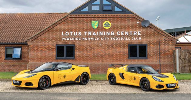
With Lotus entering a new era spearheaded by the Evija all-electric hypercar, the British carmaker has unveiled a new logo to mark this major global transformation. The logo was revealed as part of a multi-year deal with Norwich City Football Club prior to the start of the 2019/20 Premier League season.
In terms of design, the new roundel badge isn’t dramatically different to the previous one, as it forgoes the 3D effect for a simpler 2D look with block lettering instead. Lotus’ trademark use of British Racing Green and yellow colours are still present from before.
According to Simon Clare, executive director of global marketing at Lotus, the company “looked back at the original Lotus roundel and thought about Colin Chapman’s philosophy, to simplify and add lightness.” Yes, the philosophy is applicable not just to cars.
“We’ve applied that to create a new roundel, taking the weight out of the lettering and adapting the spacing,” he added, as reported by Top Gear.
Beyond the Evija, the British marque has plans for another sports car based on a heavily revised version of an existing architecture. There’s also a Lotus SUV in the works, as suggested by spyshots of a prototype disguised as a Lynk & Co 01.
Looking to sell your car? Sell it with Carro.


Mr Cardock.. Ready ur money
Lotus hypercar, and it is all-electric. Rejoice!
Aiyoyo Tony Fernandes’ ex-lover
Norwich City FC previously sponsored by P1
It would be better if P1 logo is changed as well.
The early 2000s had the best Proton Logo with the colored tiger. The new one lookes like someone played with a bunch of shapes in Microsoft paint.
Hard to see the changes until I saw they remove the chrome elements from the logo.
looks awful. new hypercar us the wrong direction fir lotus.