
![]()
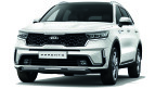
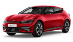
Kia’s new identity has been a long time coming. The company’s revamped logo made its first appearance on the Imagine concept in Geneva last year, and since then it has been seen in patent images and spyshots of future models. We now know that the South Korean carmaker will also change its slogan to “Movement that Inspires” to go with the rebranding.
Korean Car Blog discovered the logo and tagline, which had surfaced on the Korean Intellectual Property Rights Information Service (KIPRIS) website earlier this month. The new branding ditches the oval outline that has been a hallmark of the company since 1994, while the Kia script has been stylised and uses vertical and diagonal lines exclusively.
“Movement that Inspires” will replace the current slogan, “Power to Surprise”, which was introduced in 2012 together with a mild refresh of the oval logo. That tagline coincided with a period of growth for Kia, during which it produced a brace of new and increasingly stylish models and made a concerted move upmarket with the introduction of the K9/K900 luxury sedan.
We could see the new logo and slogan’s official debut as soon as next month, as Kia puts its “Plan S” strategy into motion. According to Automotive News, CEO Ho Sung Song said that the company aims to be “more dynamic, stylish and inventive” by launching 11 new electric vehicles by 2025, the first of which is set to be revealed next year. All-in-all, Kia wants battery electric vehicles to make up 25% of its sales by 2029.
Looking to sell your car? Sell it with Carro.


I dont get it.
K N ?
Kontena Nasional new logo…
Its KIA. The I and A is connected with K. its look like inverse N.
The A missing the slash across.
Duh, its KIA
I didnt see it the first time
Only you don’t get it haha thats not N
After the pavilion incident,I learnt Hokkien badword..”yau siew kia”..KIA
so much better than a fugly L maker’s logo
Yes, it already inspired NAZA to give up.
Logo design oso not nice. Dont expect much with their car design.
Our P1’s Thundercat logo is the bestest. Even cartoon has this logo
Proton should rebrand themselves to ProCopypasta. Useless rebadger.
Frankly, Proton logo is much better and more inspiring
If this was Perodua it would be a new name for their body kit lineup
Bring KIA TELLURIDE here.. The World Car of the year 2020
Big fan of kia user here, the logo seem more advanced then before. Looking forward to see them use in all model of car. Good job KIA. At least u did something to change. Its good that naza give KIA to others dealer, the worse dealer ever in Malaysia.
Naza has stated its intent to let go but nothing from Kia yet. Because of that we customers suffer.
Its either no one wants the brand or Kia team is very slow.
Don’t worry Berjaya Auto will be taking over the franchise here… they’re in talks now and finalizing soon… a lot of money + CKD requirement involved
I still can see the A… no big deal..
I still can see the A… no big deal.. still nice then